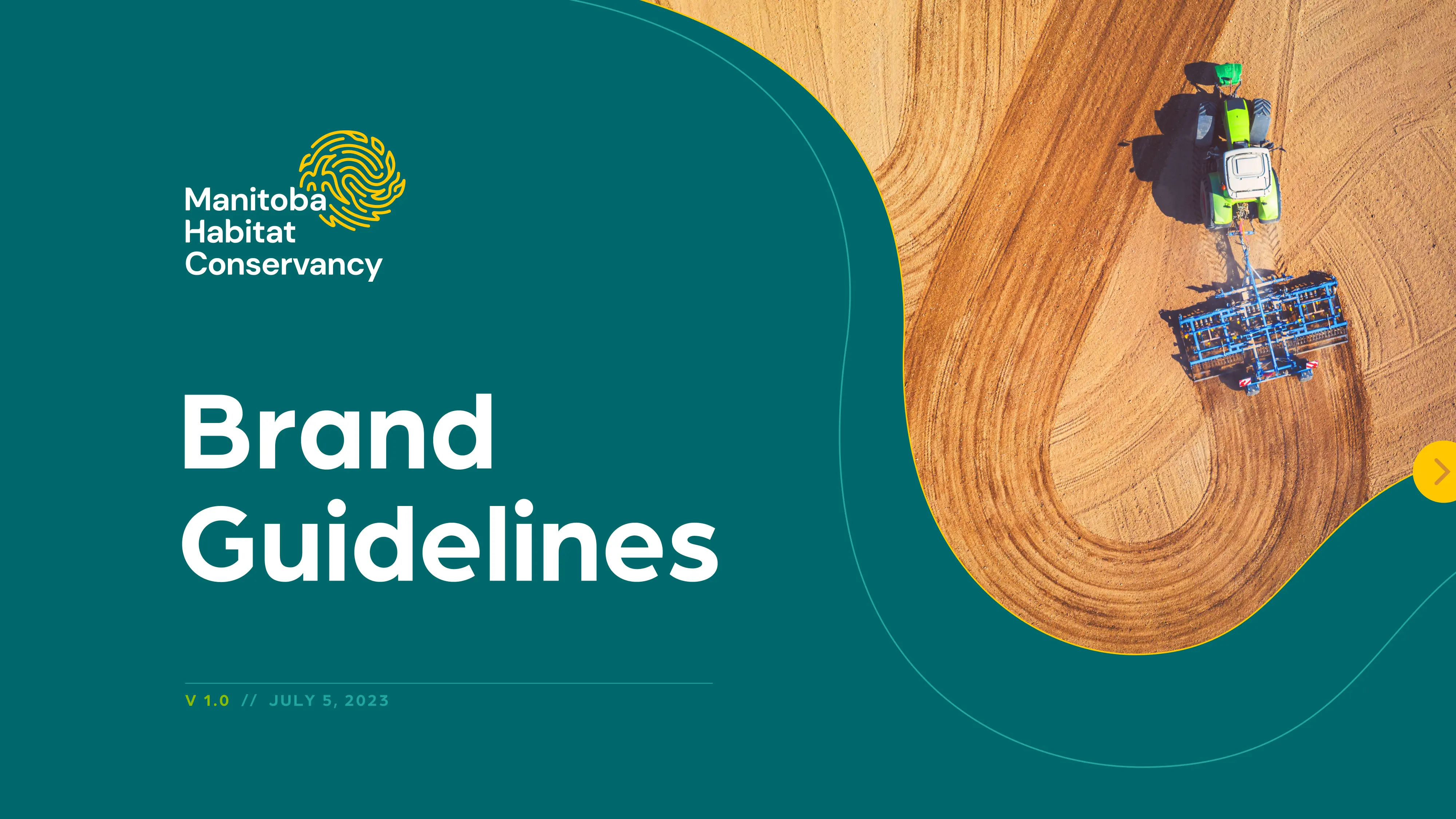
MANITOBA HABITAT CONSERVANCY
Think Shift | Role: Senior Graphic Designer*
Brand Architecture
Think Shift | Role: Senior Graphic Designer*
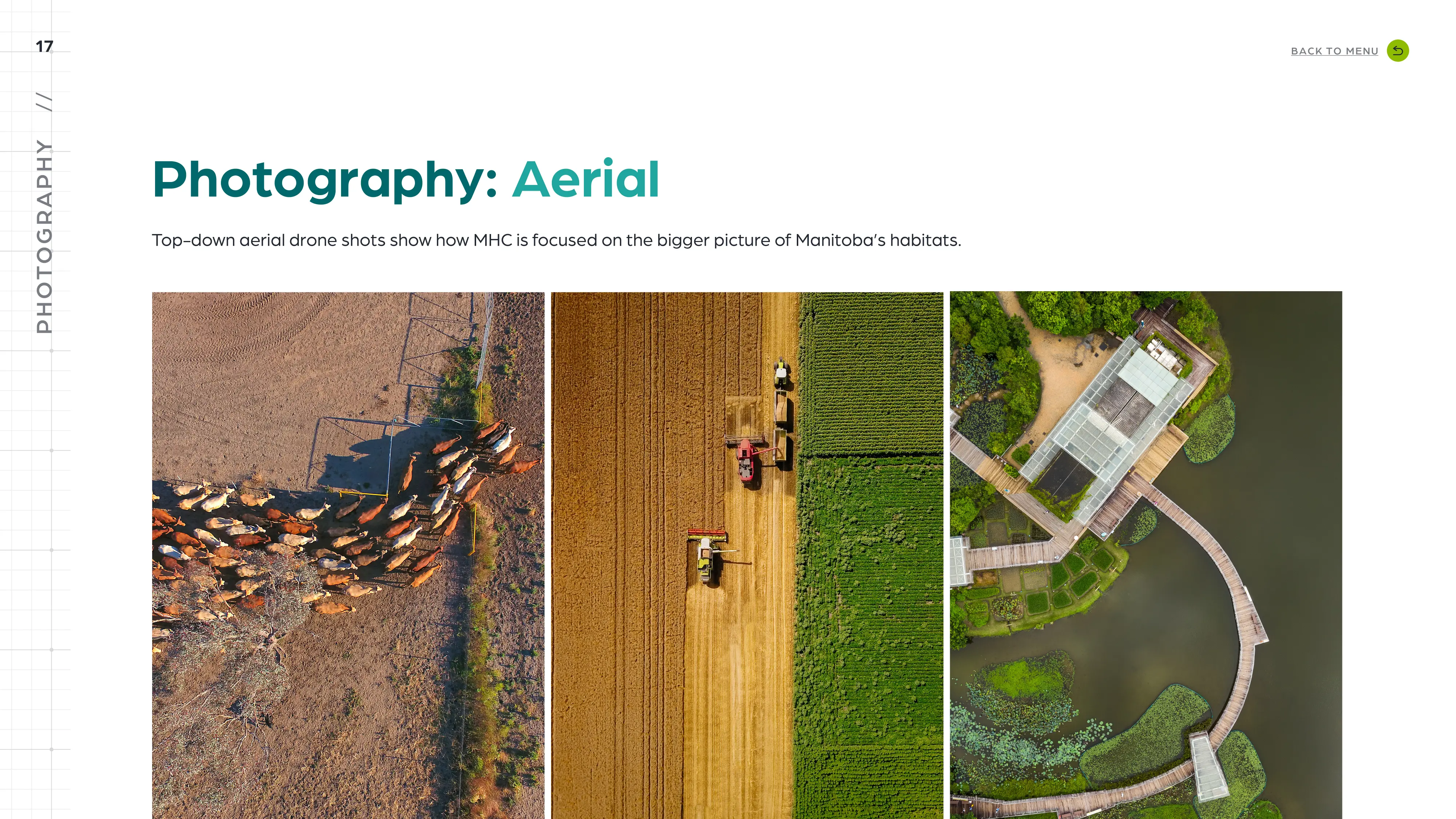
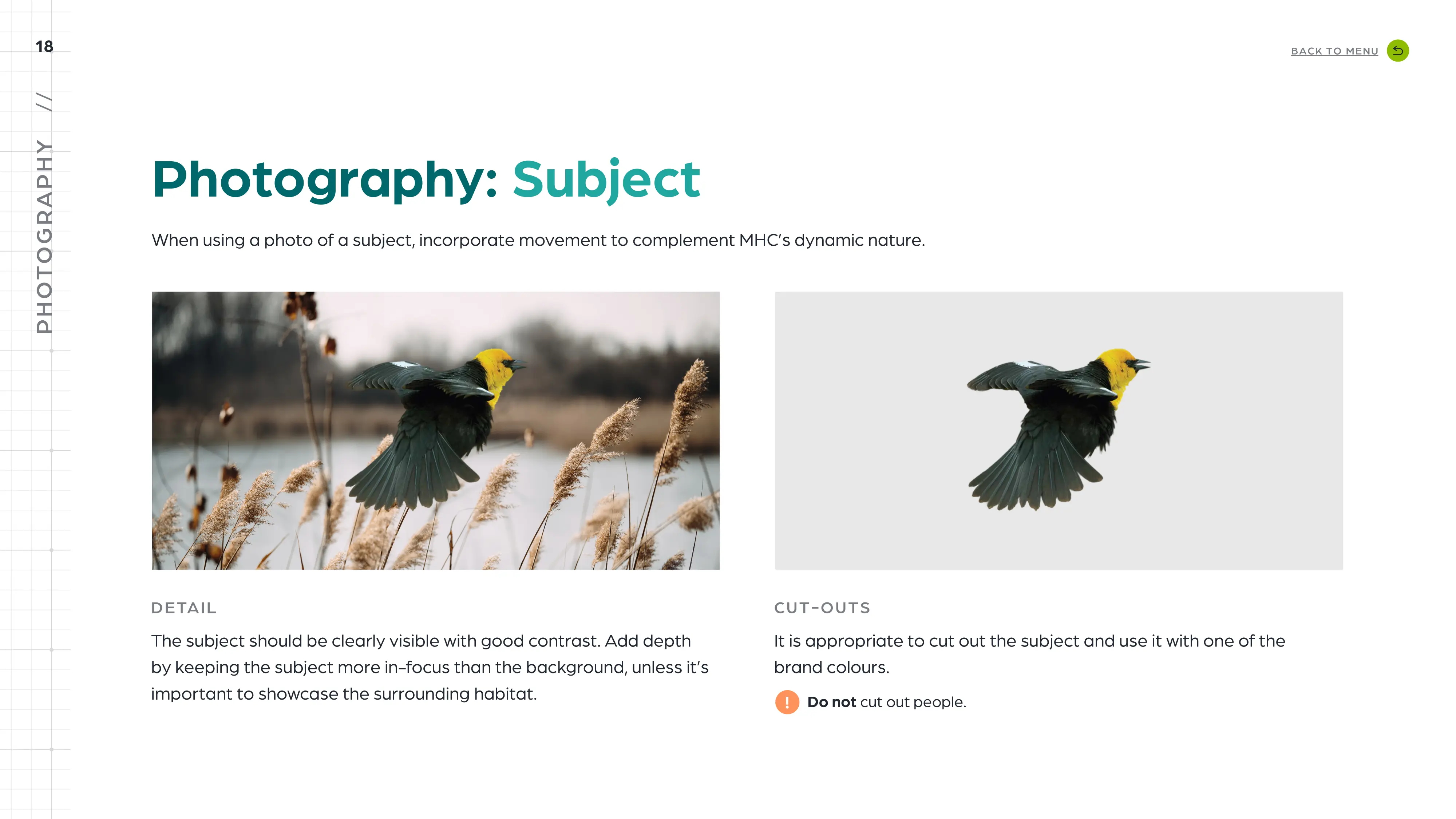
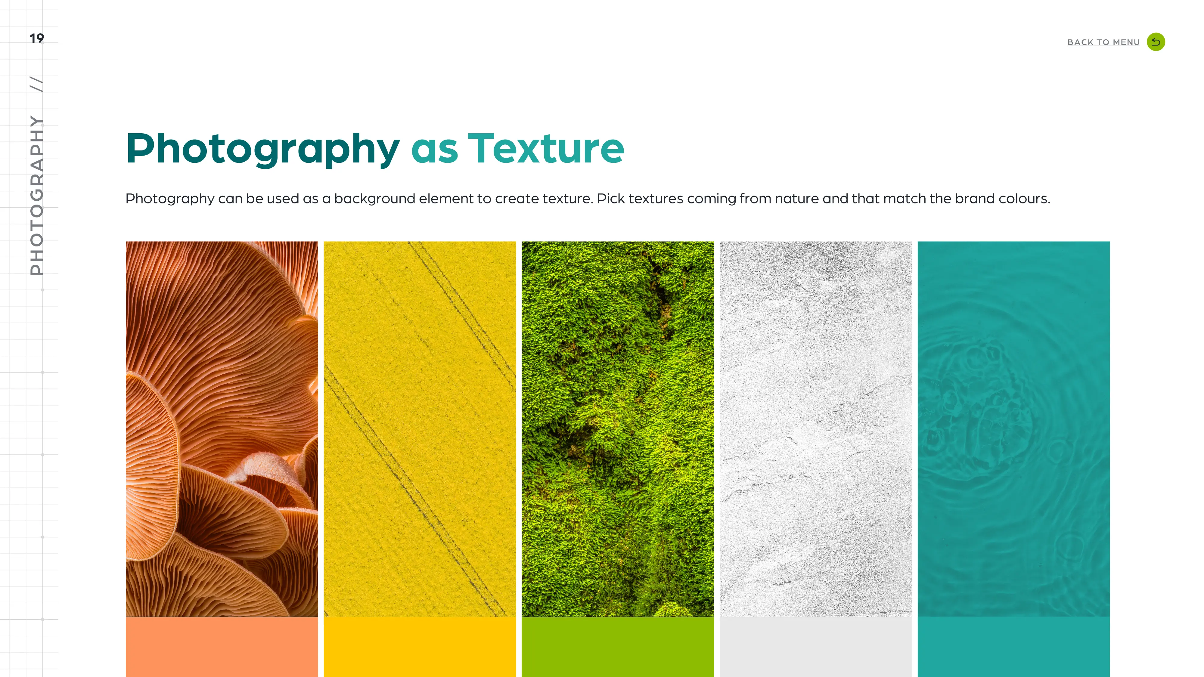
Overview
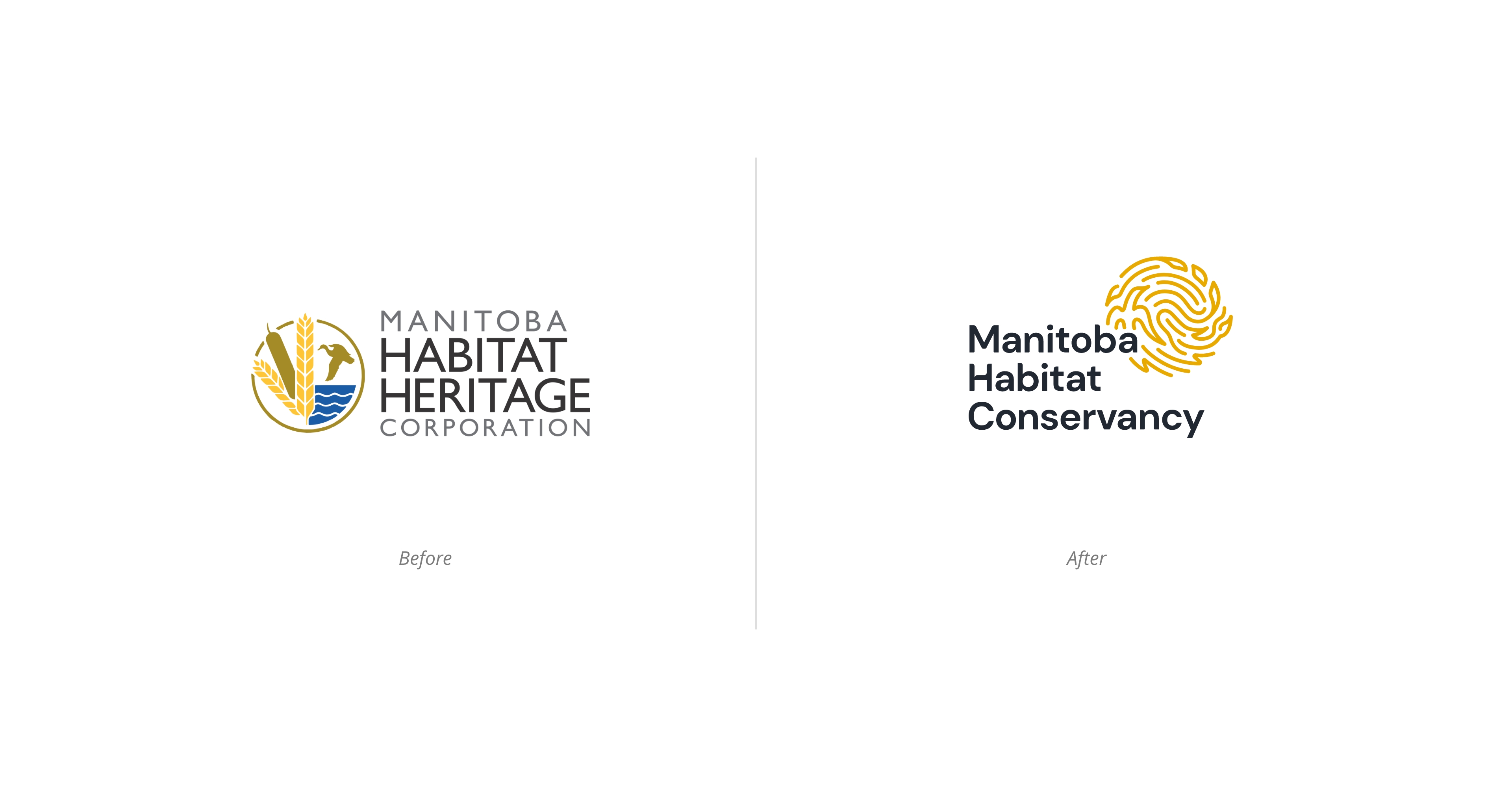
The objective was rebranding and repositioning of the Manitoba Habitat Heritage Corporation by proposing a new brand identity along with the updated name and awareness materials. Working primarily in agricultural Manitoba, MHC uses habitat conservation as a tool to improve Manitoba’s wildlife populations and general ecosystem health, by delivering diverse habitat conservation programs through partnerships with the community (the biggest of which are farmers). They offer farmers a premium in return for the Conservation Agreement designed to provide long-term protection of wildlife habitat.
OPPORTUNITY
Manitoba Habitat Conservancy (former Manitoba Habitat Heritage Corporation) came to us with the challenge. They have recently converted from a corporation to a charity and wanted to change the perception of a government corporation looking down on farmers to a trusted partner. After conducting a workshop, we have identified specific traits that make MHC different and that we would like to showcase in the new identity.
NEW POSITIONING STATEMENT
MHC has strong personal connection to the land and agriculture, and understands the value of Manitoba’s natural environments. They are boots on the ground building trust and uniting people around this greater purpose of conserving, restoring and enhancing the land. They provide their community with access to new science-based tools and approaches required to keep the lands flourishing.
INSPIRATION
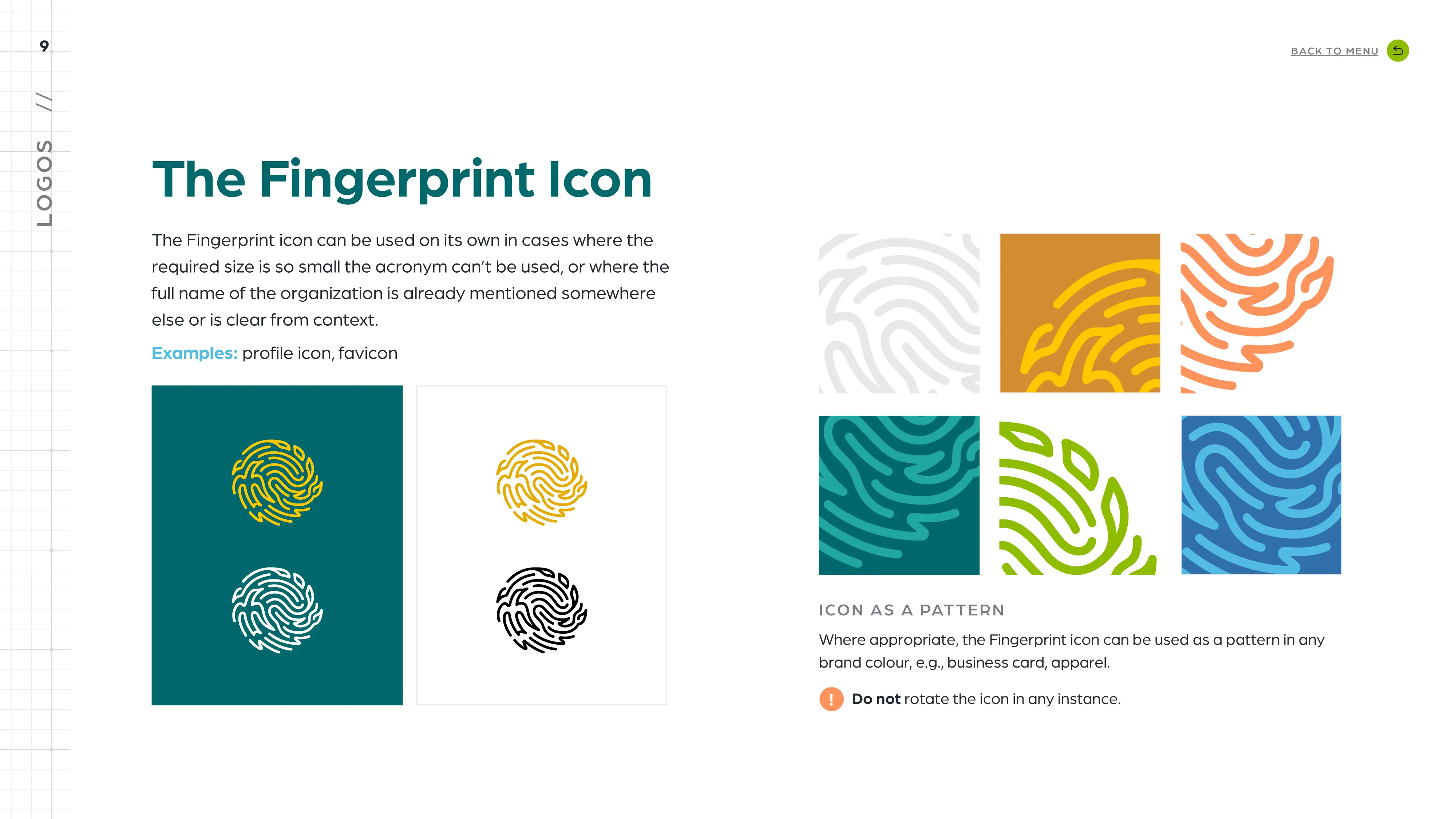
Finger print
Habitat and agriculture
Collaboration and unity
Exploration
Mark
The icon resembles the fingerprint. We’re showcasing the MHC’s hands-on approach of touching and enhancing the land. The shapes are irregular and unique which makes them approachable. Even the placement – looks like someone quickly left a mark. It’s quite effortless, but very intentional.
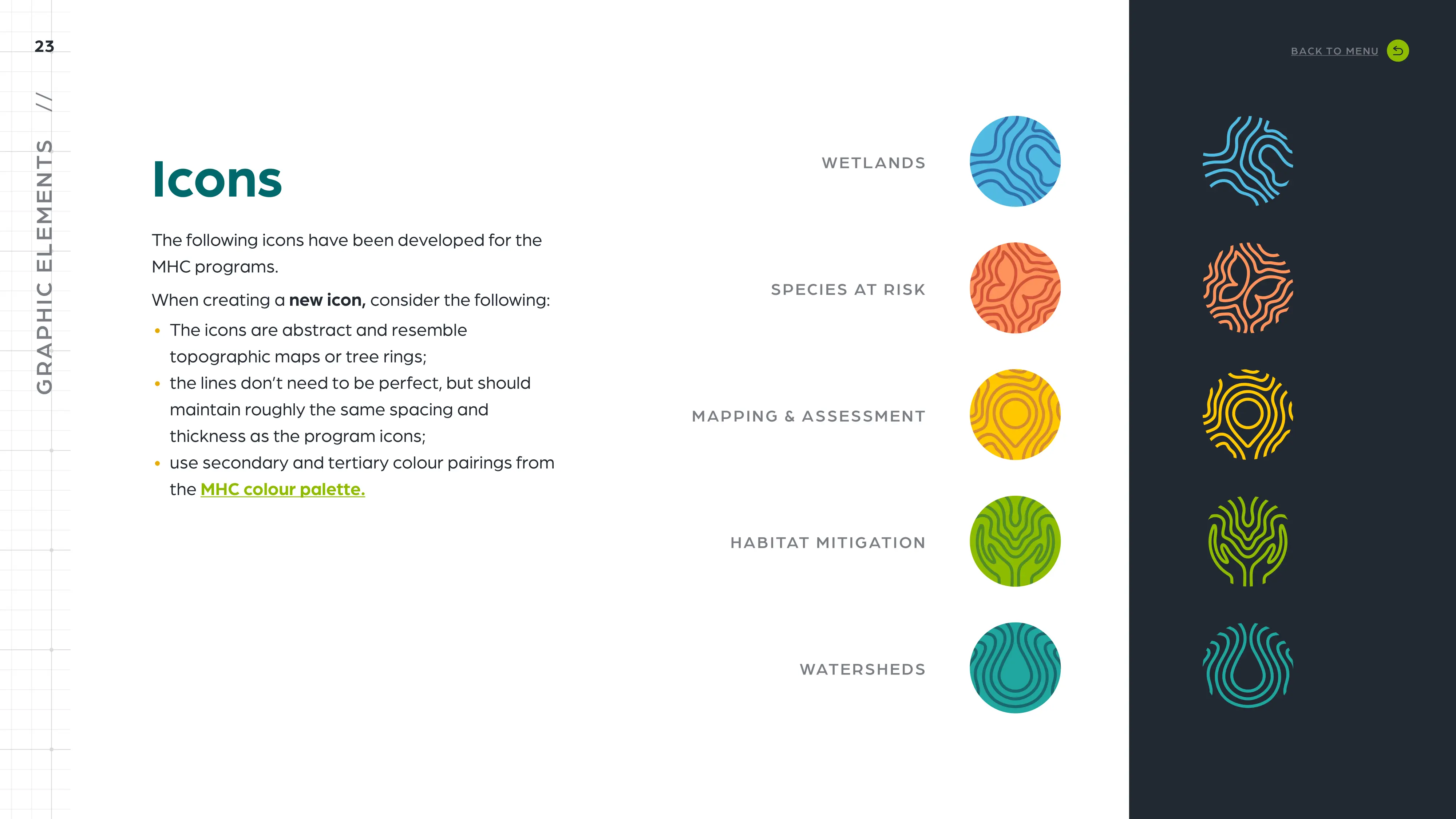
If you look closely, you will notice a fish, a duck and a crop. They showcase the variety of programs and conservation efforts of MHC. All of these elements are coming together in a circular motion reinforcing protection and unity in collaboration with the farmer and the habitat.
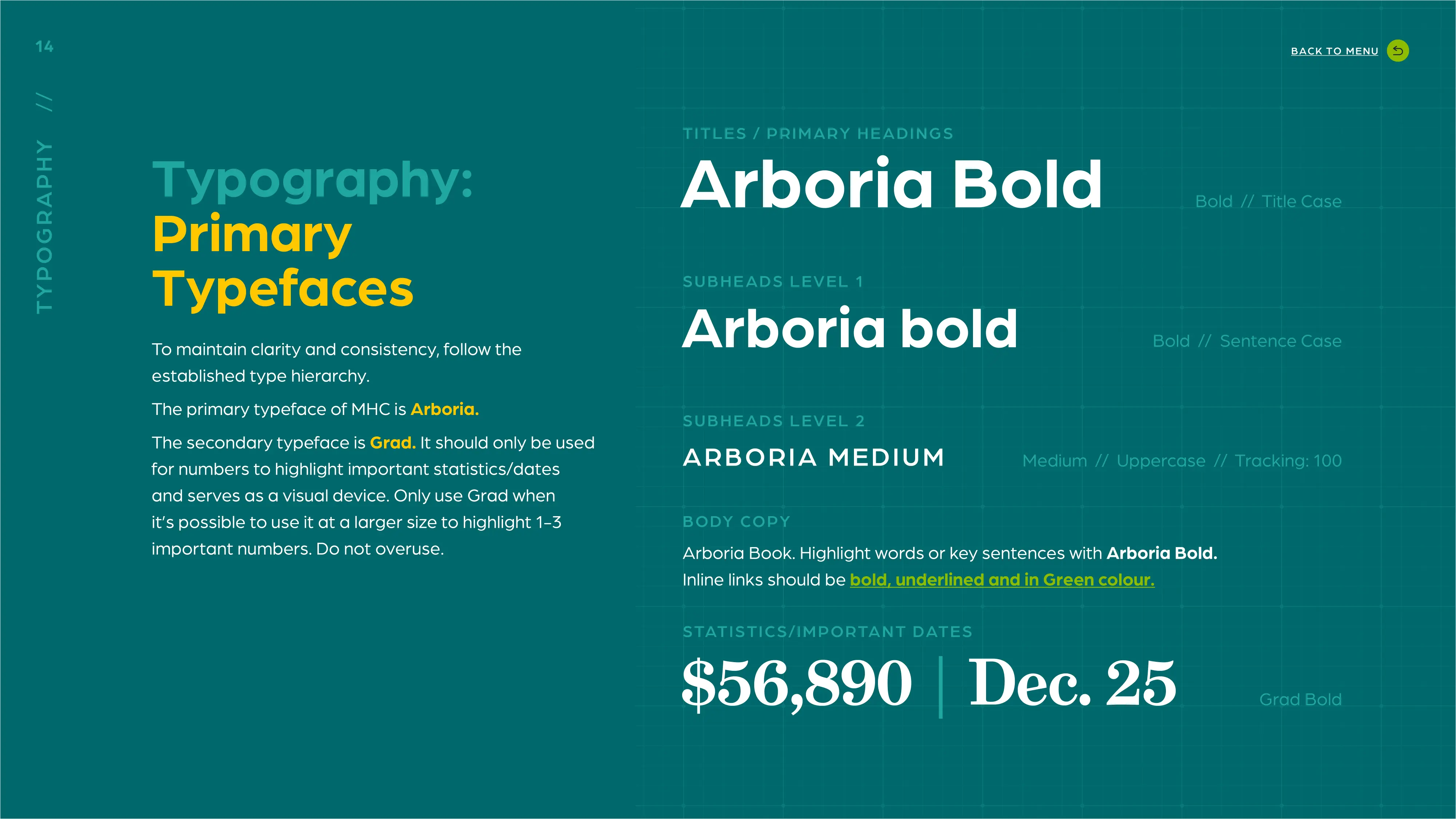
TYPOGRAPHY
Type has approachable nature and rounded corners that tie it in with the mark. There’s a little detail hidden in the top part of the H. It can be viewed as a speech bubble reinforcing the idea of the MHC having a conversation with the farmer rather looking down on them as some government corporation.
COLOUR
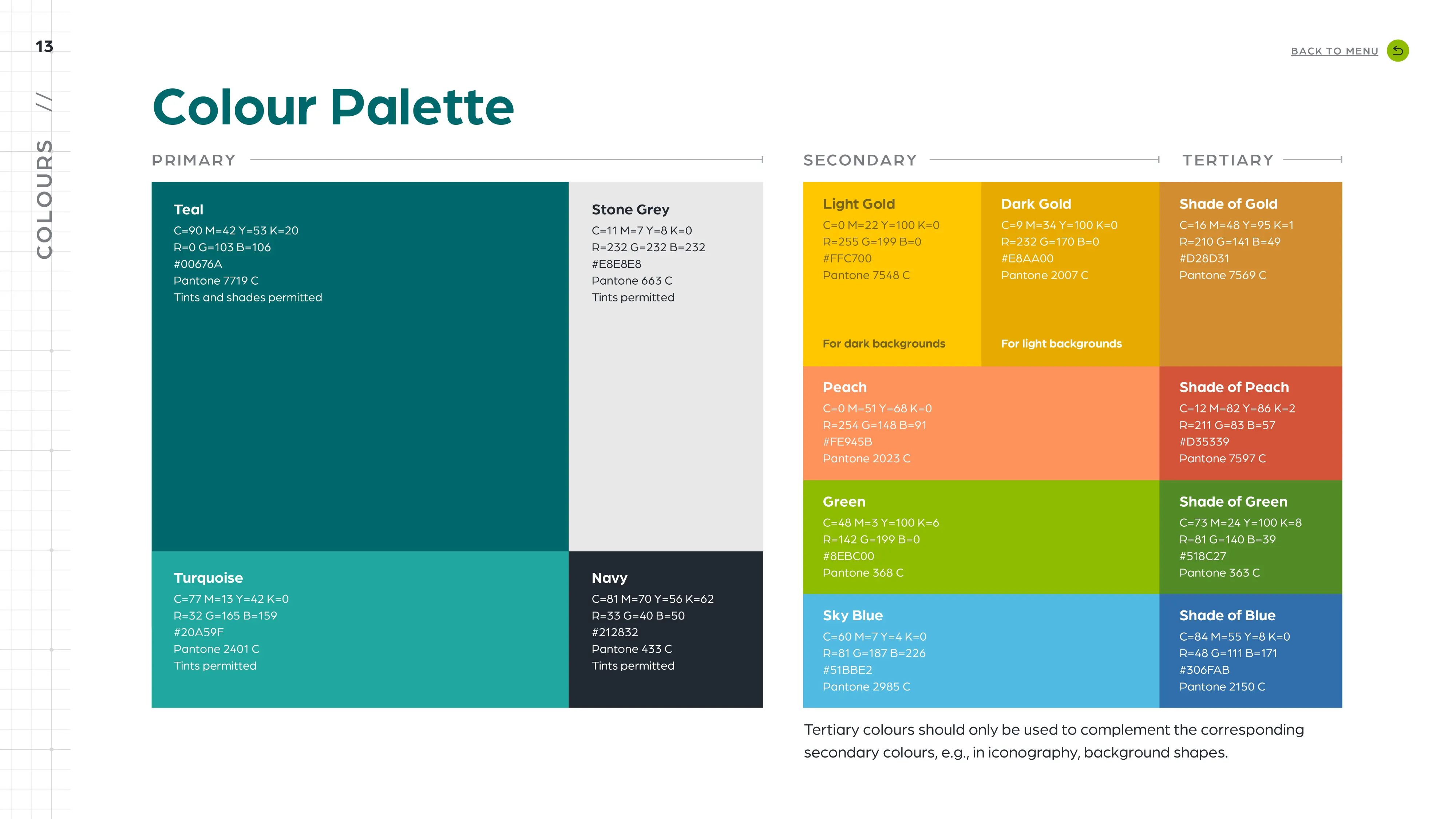
After the competitive analysis, gold has been determined the most suitable colour along with the rest of the identity colours. Bright colours that cover a large spectrum allow us to differentiate between the programs as well as to appeal to different audiences.
IDENTITY SYSTEM
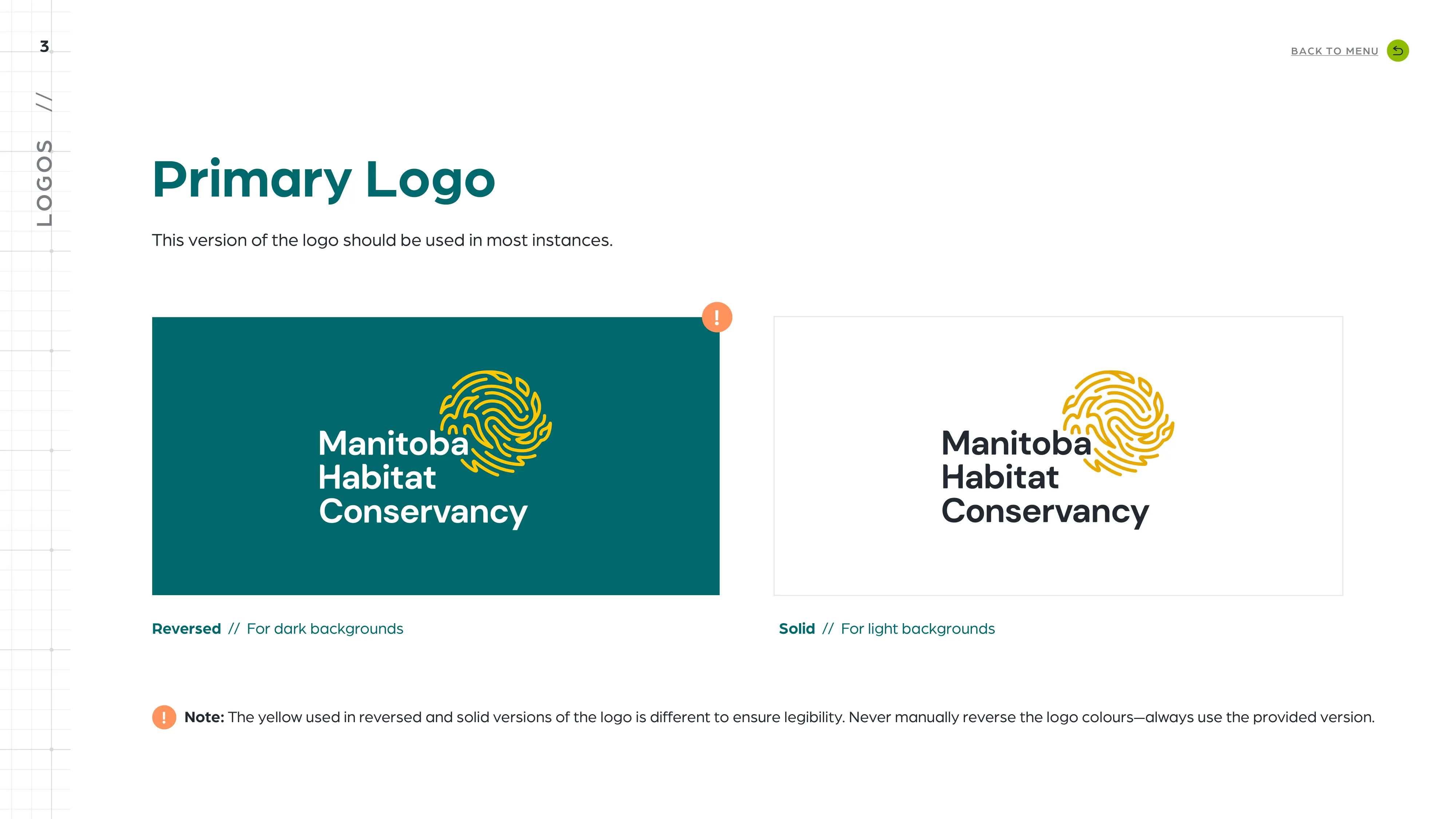
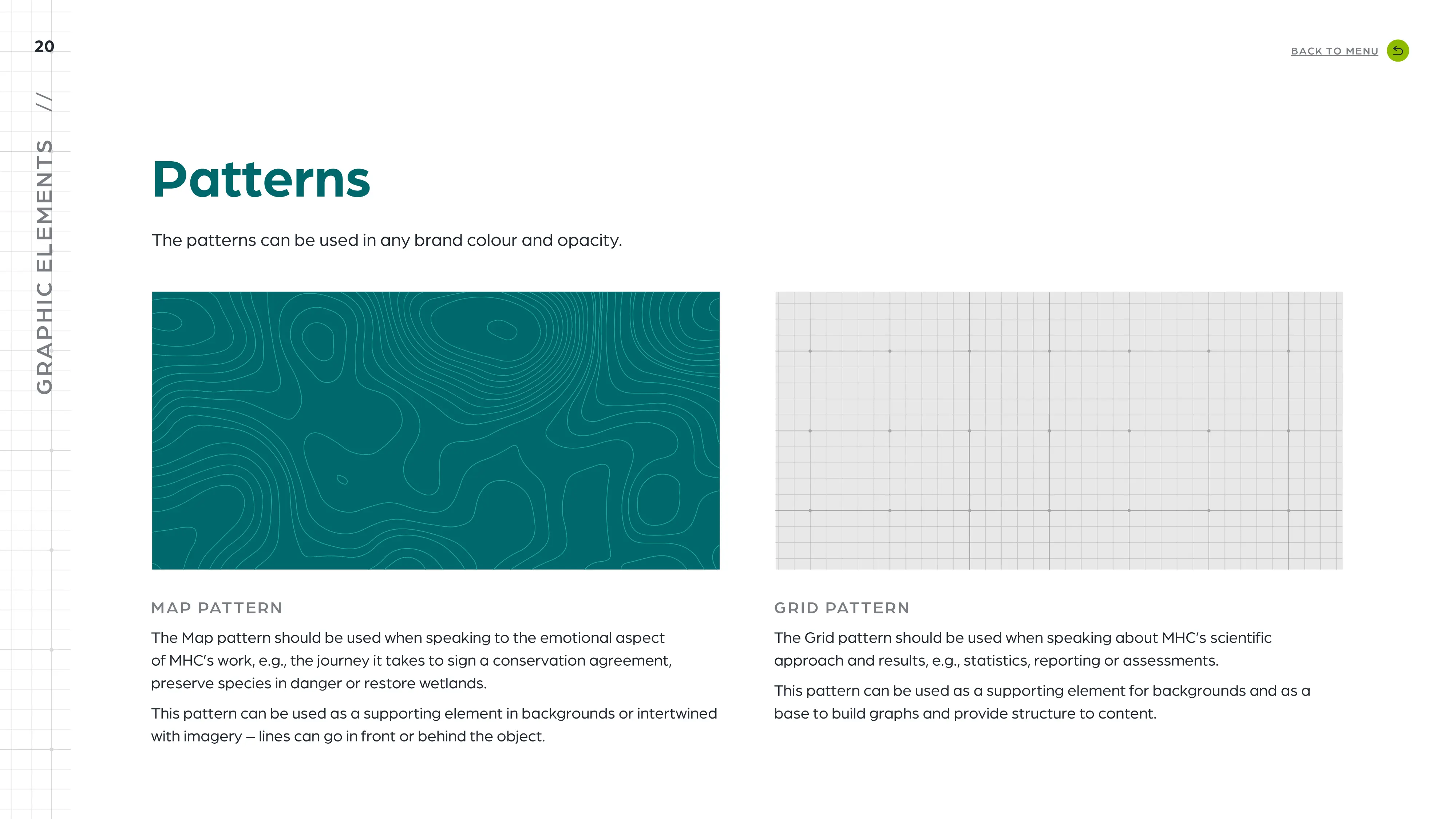
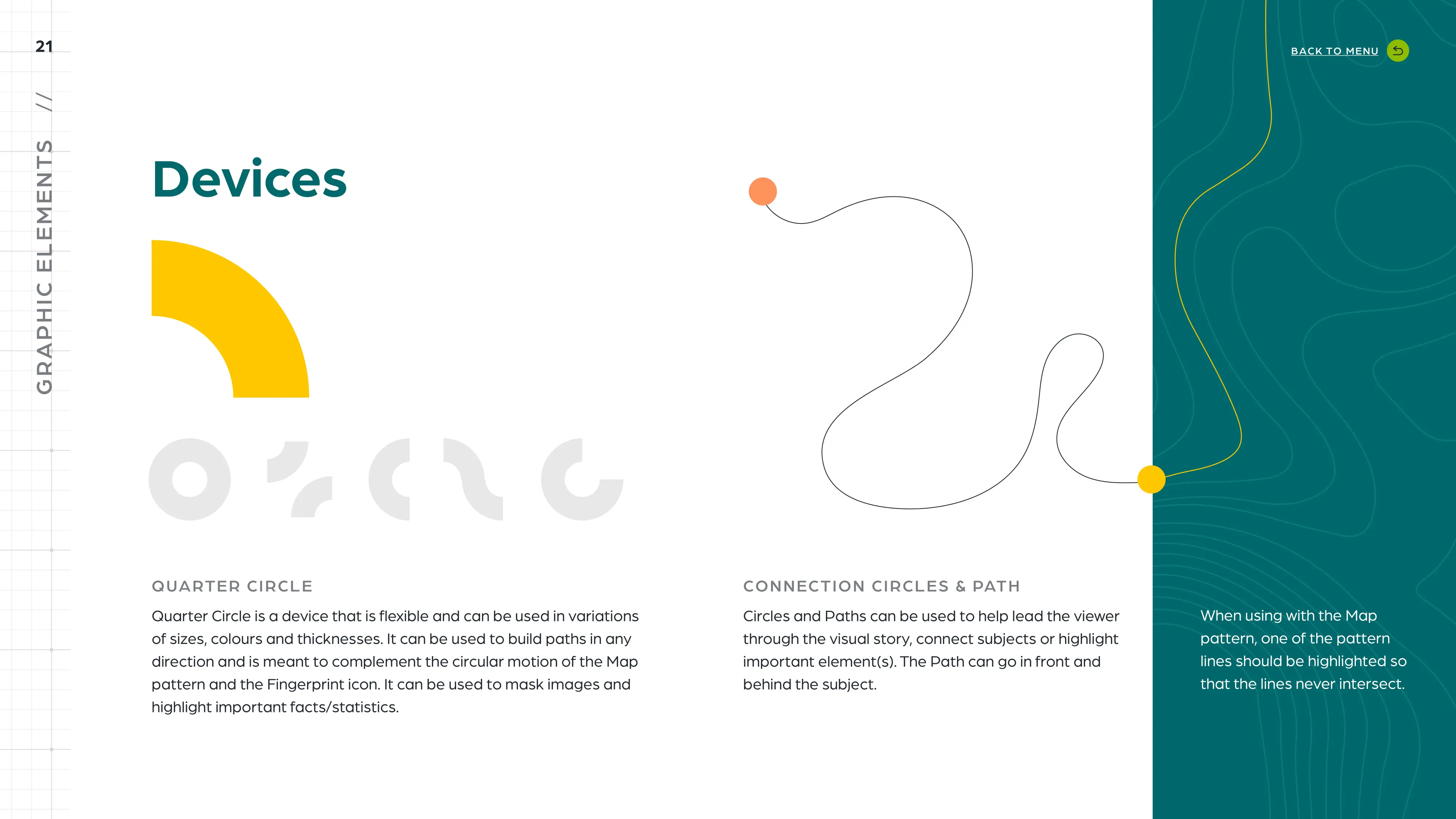
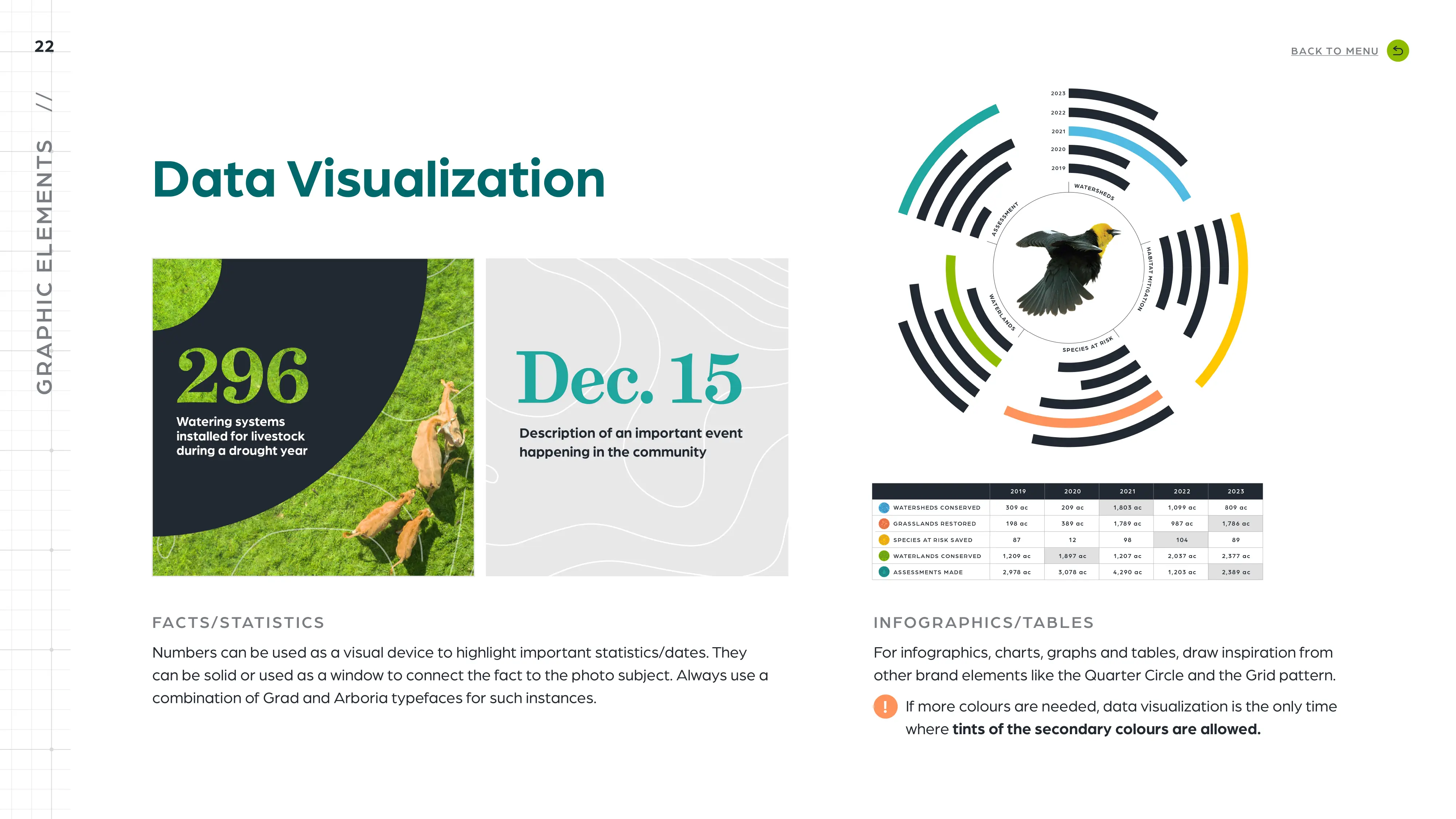
The brand identity heavily relies on textures and patterns found in nature. Circular and flexible shapes complement the new positioning statement as does the responsive logo that can adapt to a variety of screen frames. It has been determined that the acronym “MHC” will be an acceptable version of the logo. To ensure consistent usage of the identity, we have created Brand Guidelines.
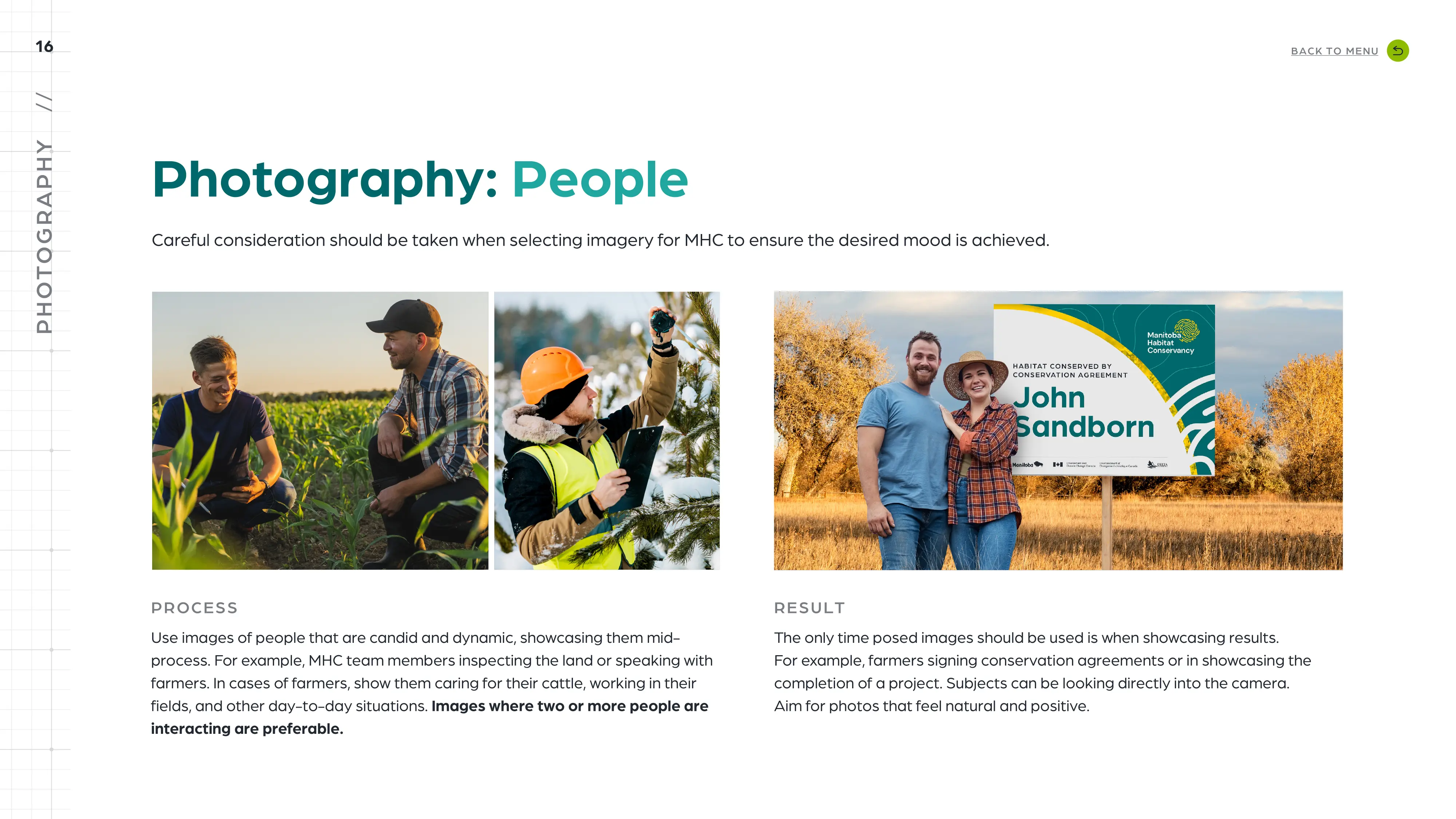
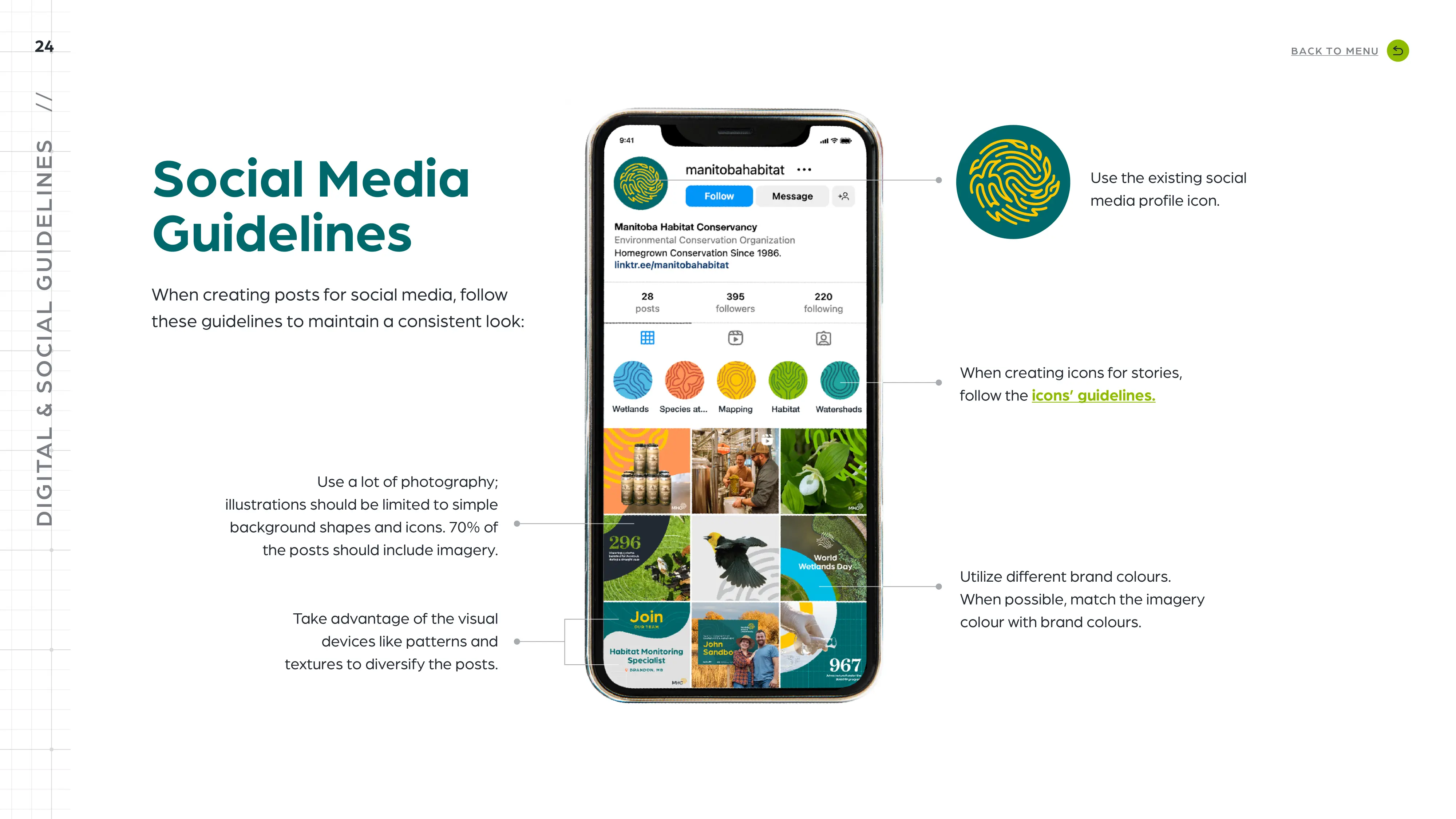
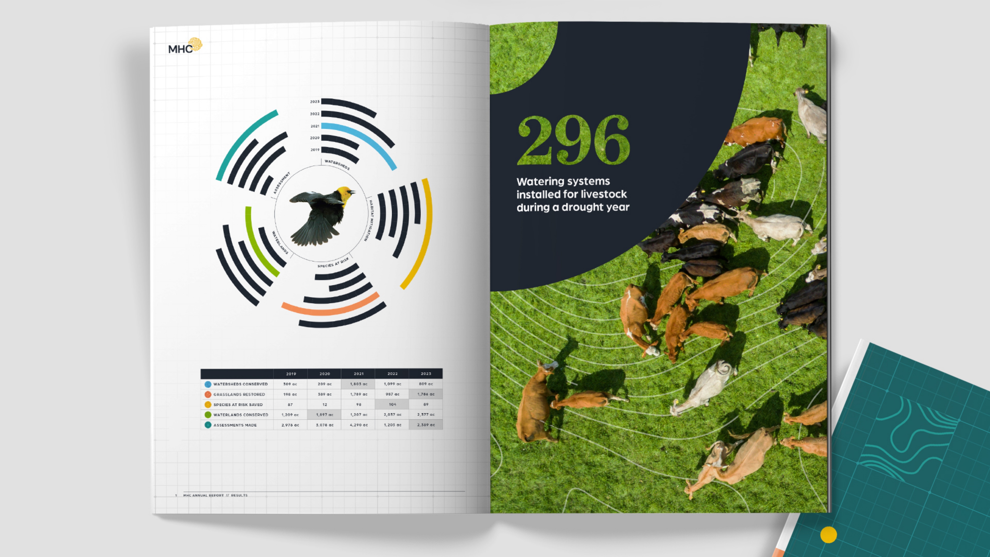
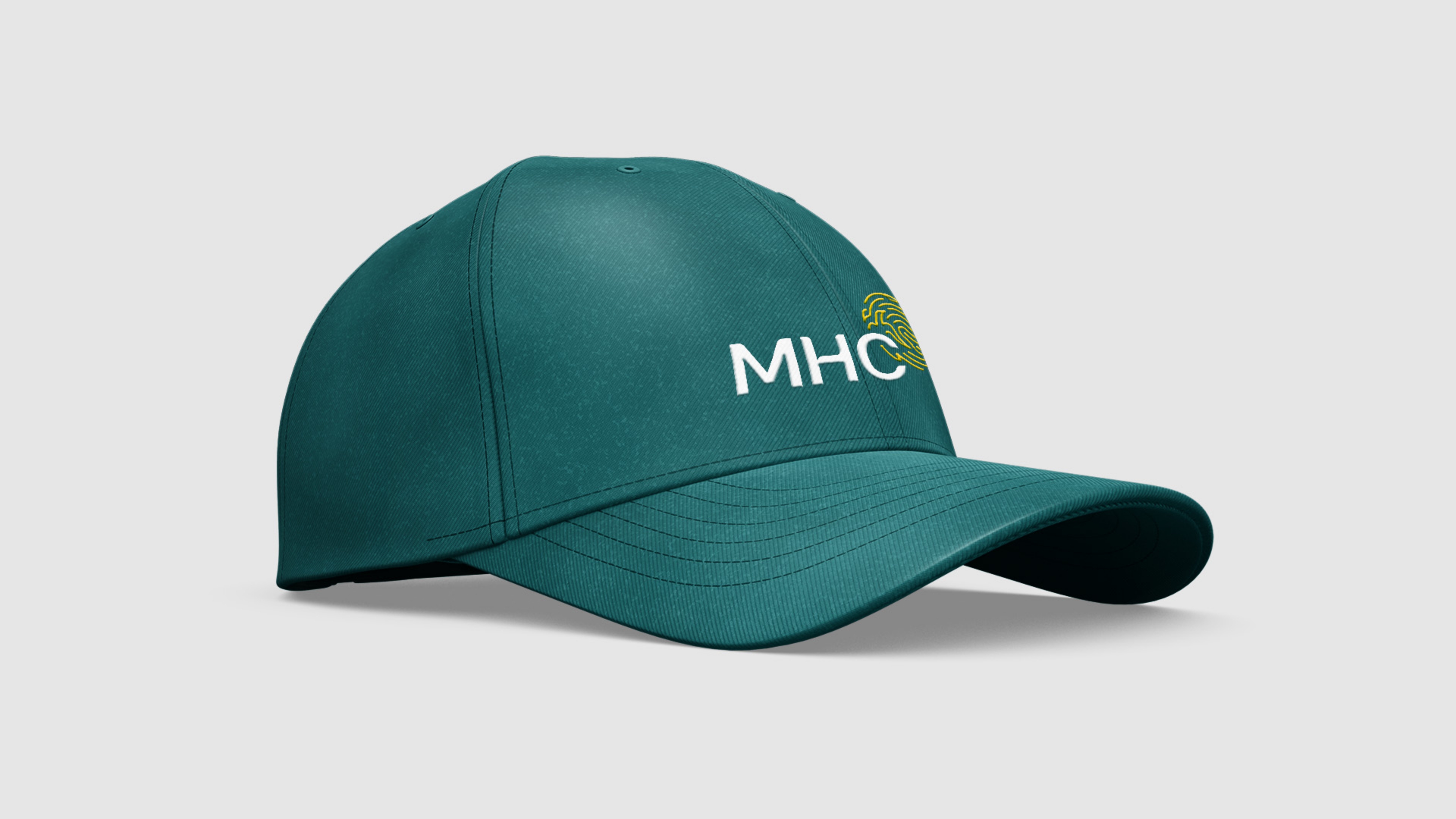
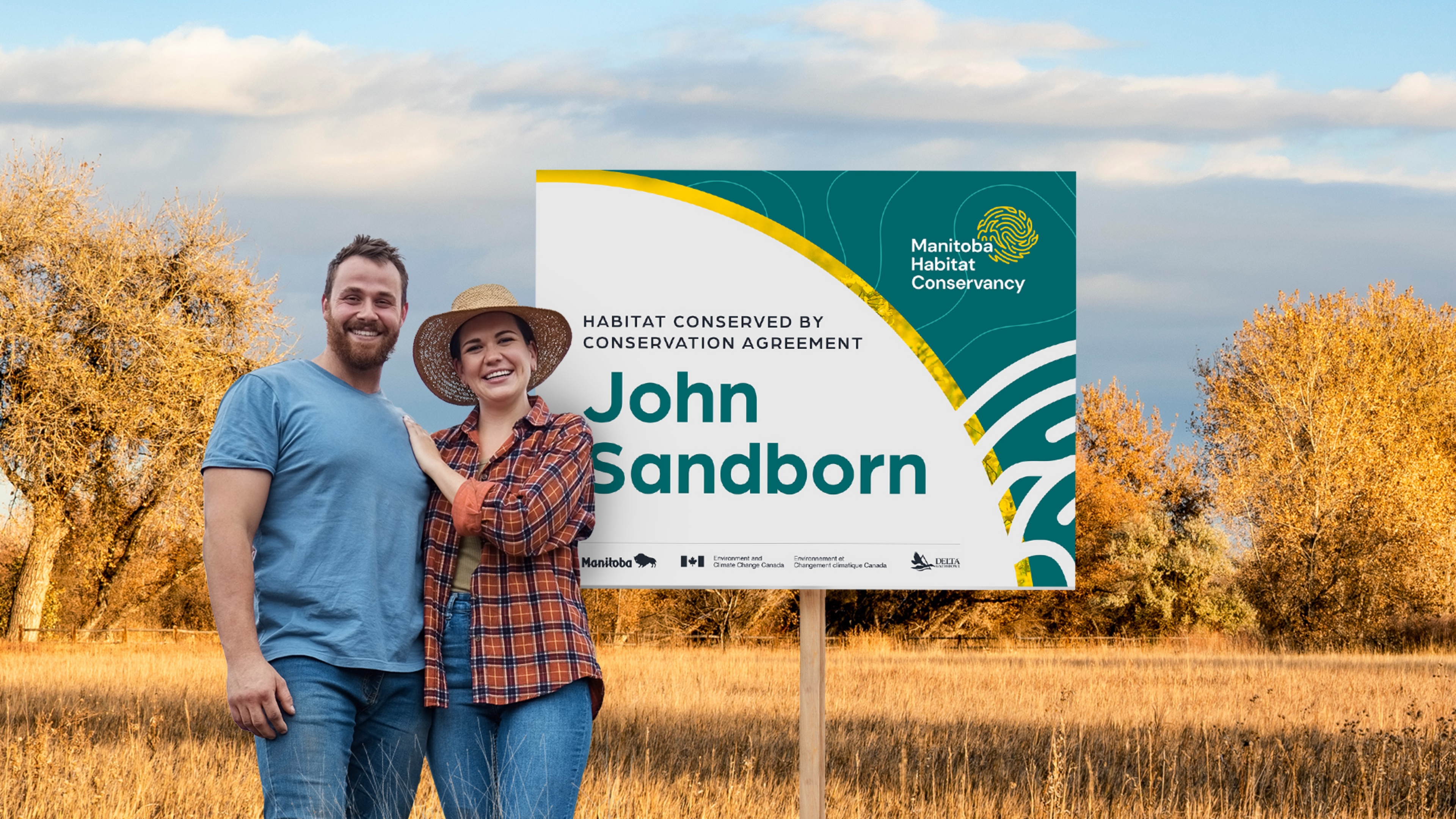
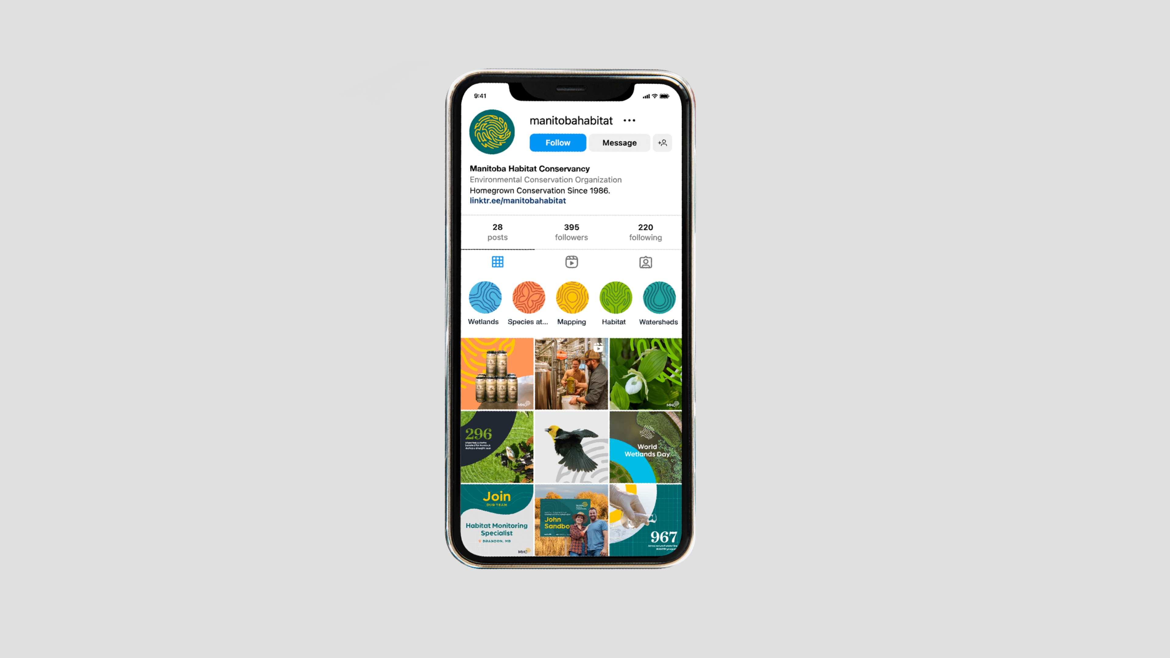
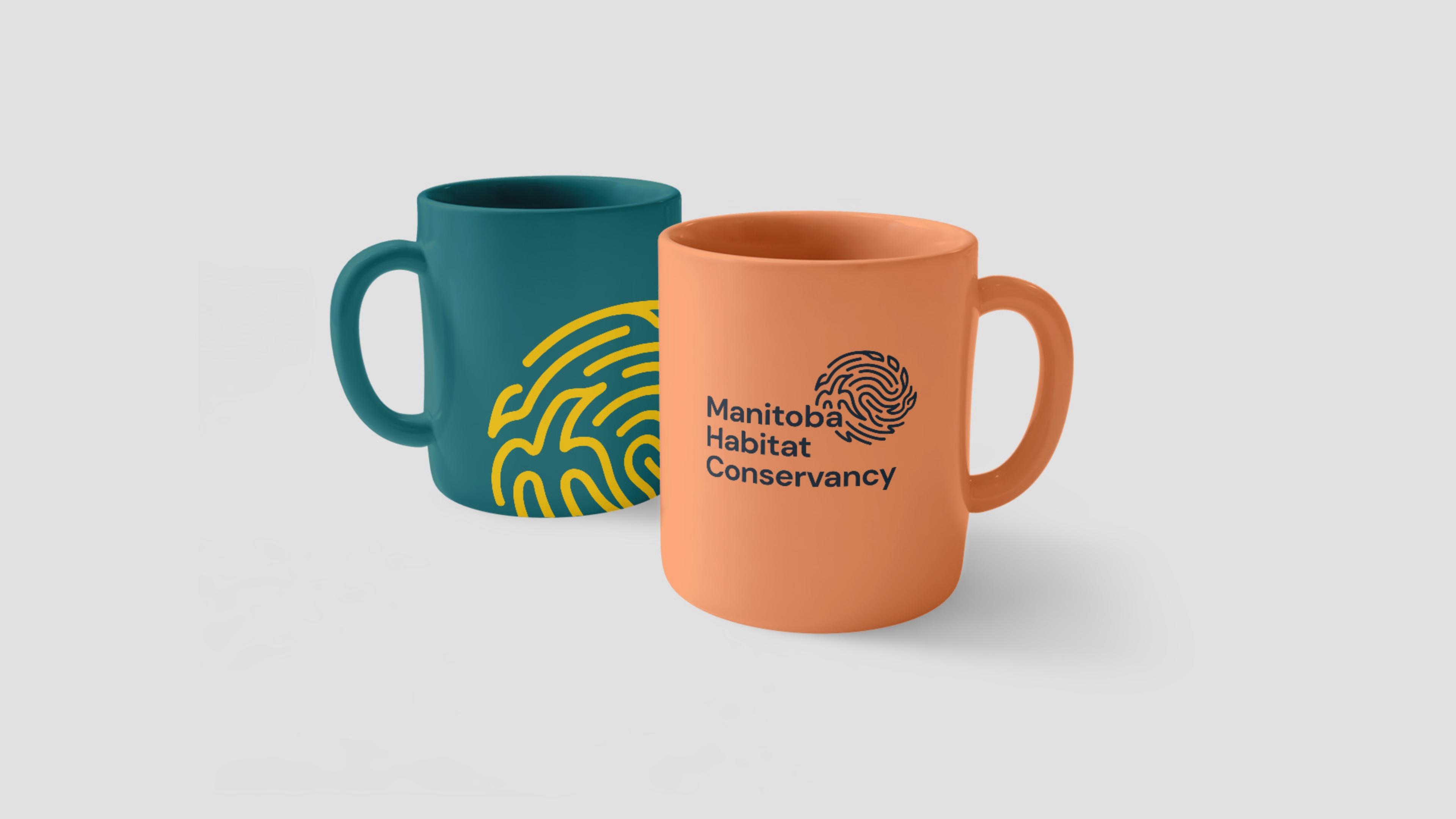
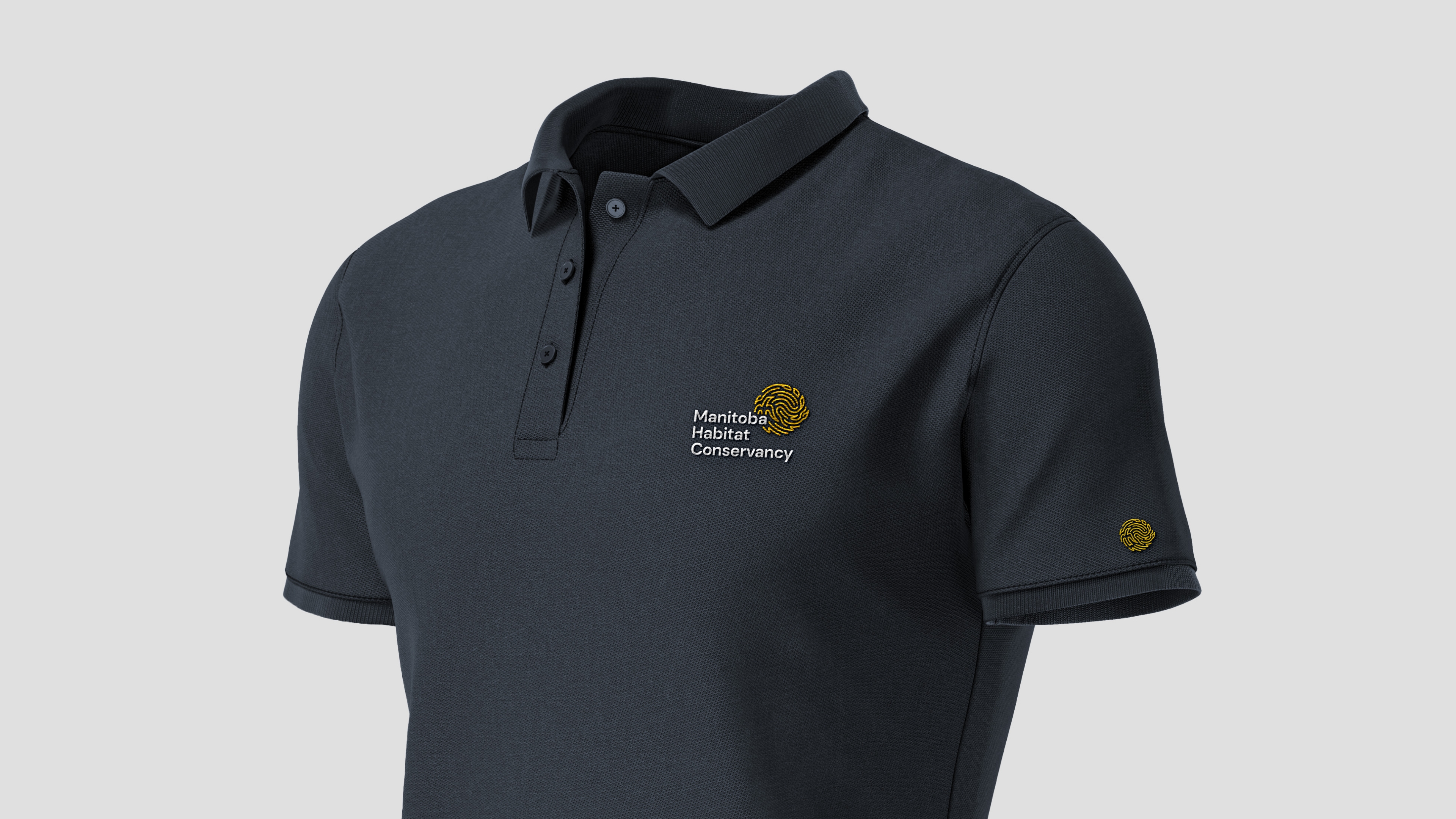
Below are some expressions that showcase the branding in real life. With this flexible brand, the possibilities are limitless!
*CONTRIBUTION
I designed the logo and the rest of the ecosystem with the oversight from the Art Director.
Next Project
Arete Endurance
Brand Architecture
![[object Object]](/assets/images/projects/arete-endurance/arete_Hero.jpg)