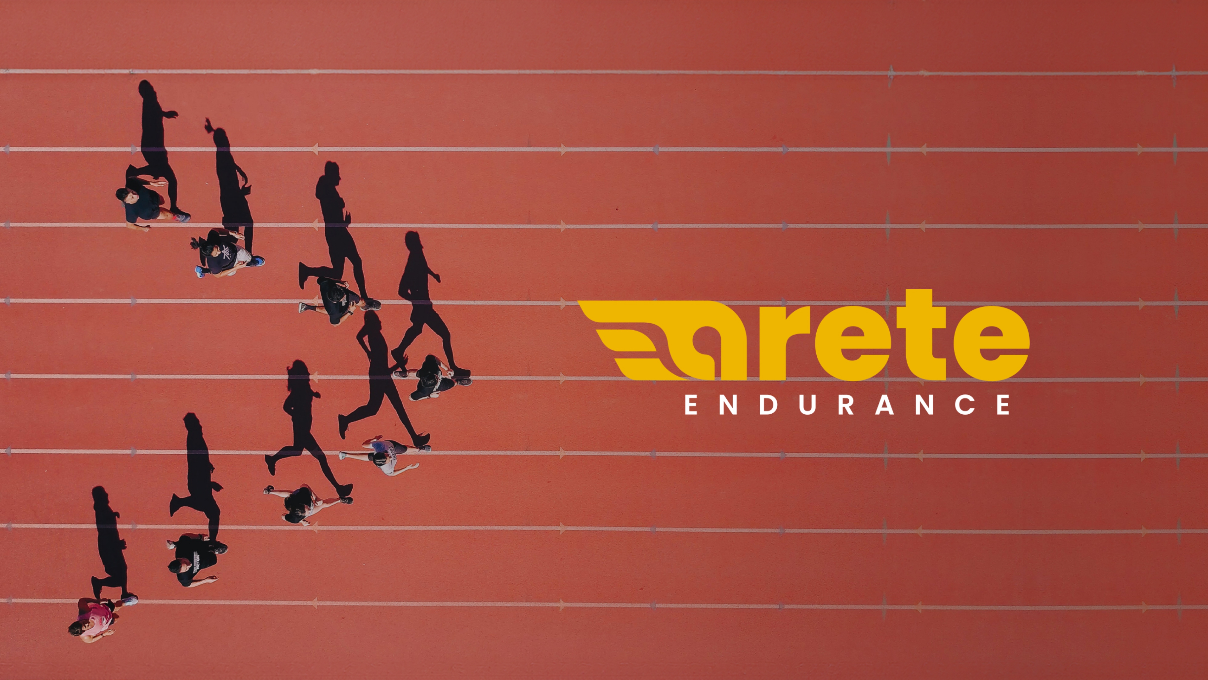
ARETE ENDURANCE
Brand Architecture
Overview
Arete Endurance has a unique coaching philosophy that the balance of mind, body and soul is key to achieving excellence. They are focused on helping experienced athletes to reach their highest potential by providing professionalism, support and individual approach.
OPPORTUNITY
There’s a unique opportunity to rebrand the visual identify to align it better with brand story of excellence and achieving your highest potential. In the process of redesign, we strived to differentiate the logo from competitors and make it a strong symbol in the community. Another goal was to make the logo more flexible in order for it to work for a number of applications, specifically, merchandise.
NEW POSITIONING STATEMENT
Arete Endurance has a unique coaching philosophy that the balance of mind, body and soul is key to achieving excellence. We are focused on helping experienced athletes to reach their highest potential by providing professionalism, support and individual approach.
INSPIRATION
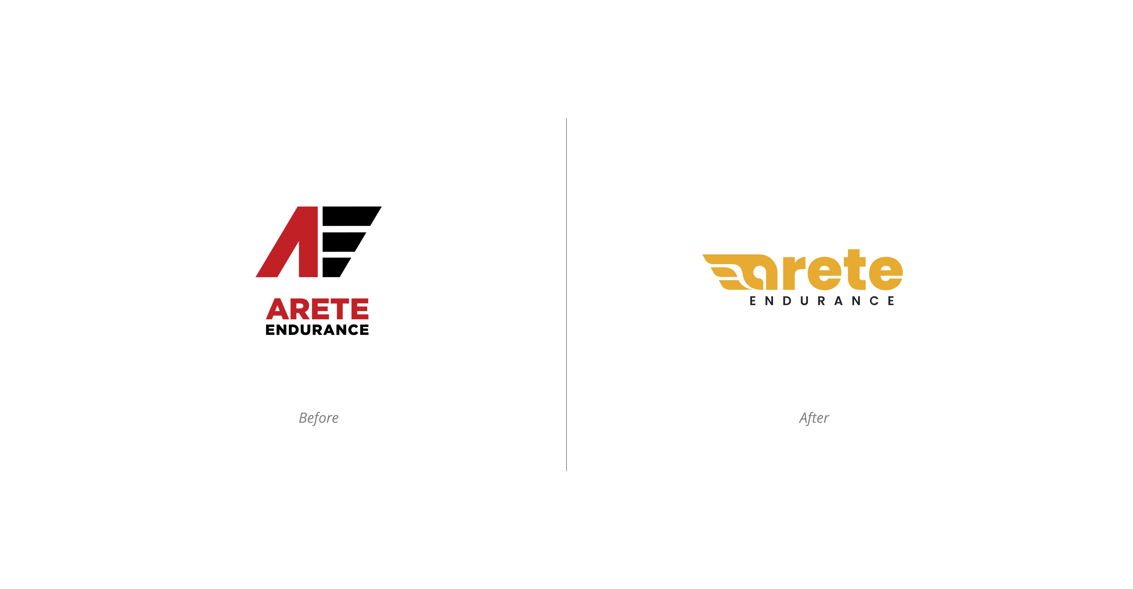
Speed and dedication
Hermes sandal = excellence
Support and community
Exploration
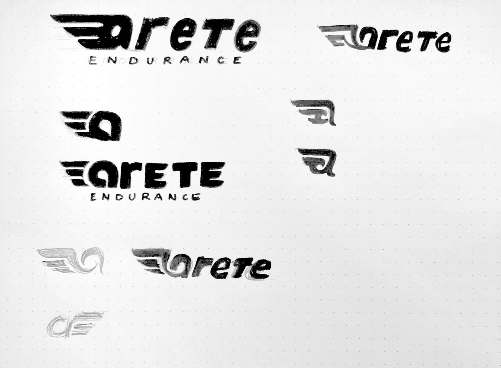
DESCRIPTION
The “a” includes three lines hinting at the three components required to achieve excellence: a balance of mind, body and soul. “Arete” originates from the Greek “excellence,” so you’ll notice a nod to the Greek mythology in the “a.” Together with the lines, it forms a stylized wing. In Greek mythology, the god Hermes has wings on his sandals and is the messenger of God.
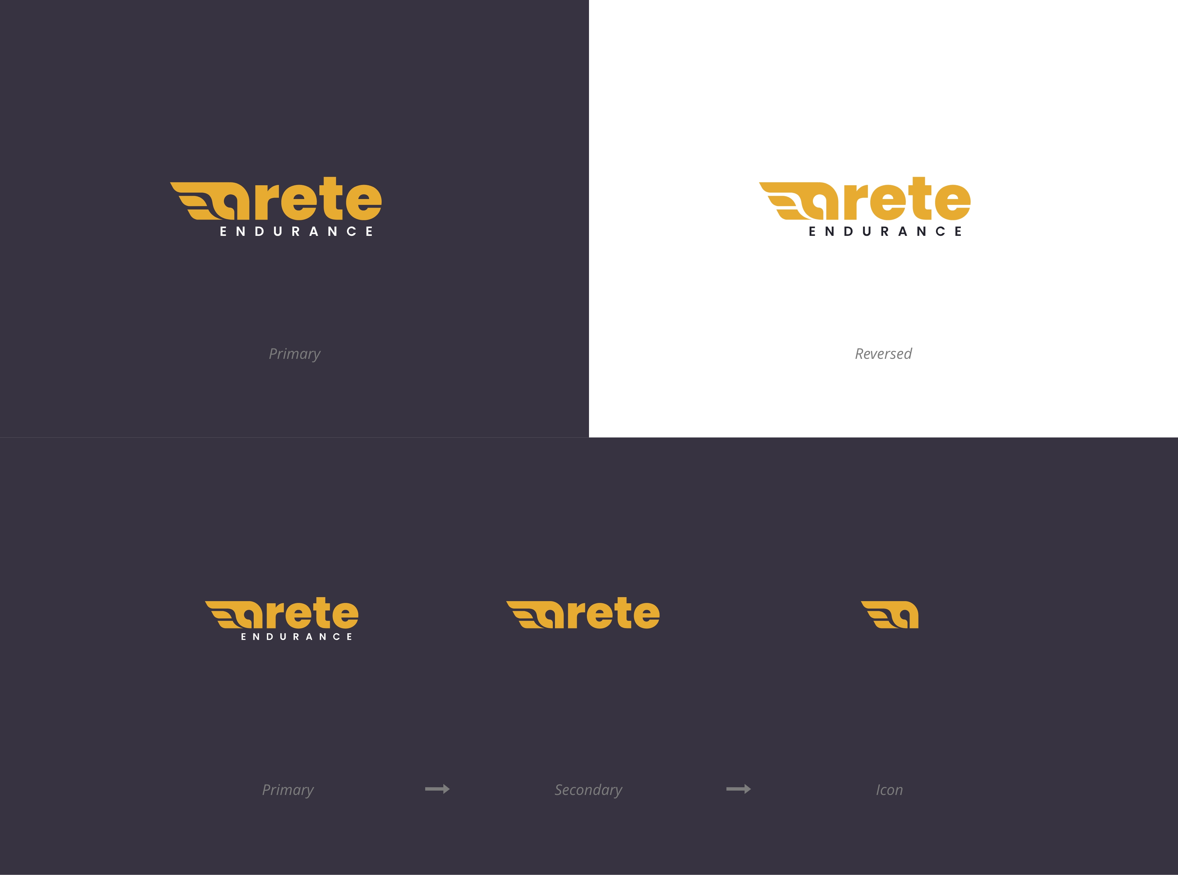
Here, the idea is that the athlete is running so fast, he’s almost flying over the finish line. The wing is subtle enough, but provides uniqueness to the logo. As a part of the brief, we focused on making the logo flexible for all sizes. The “a” became the most recognizable symbol of the logo providing us with the opportunity to reduce the logo to just the “wing” mark.
COLOUR
The gold and grey combination it’s associated with Olympics, winning gold, being excellent. We moved away from the red as we want the brand to appear inspirational and too much red can be associated with pain.
TYPOGRAPHY
An inviting, approachable yet structured typeface is used to create a continuous flow to the right. The logo is very dynamic due to the prevalence of the horizontal lines and angled shapes. That is also the reason for the full lowercase name: it reads a one shape.
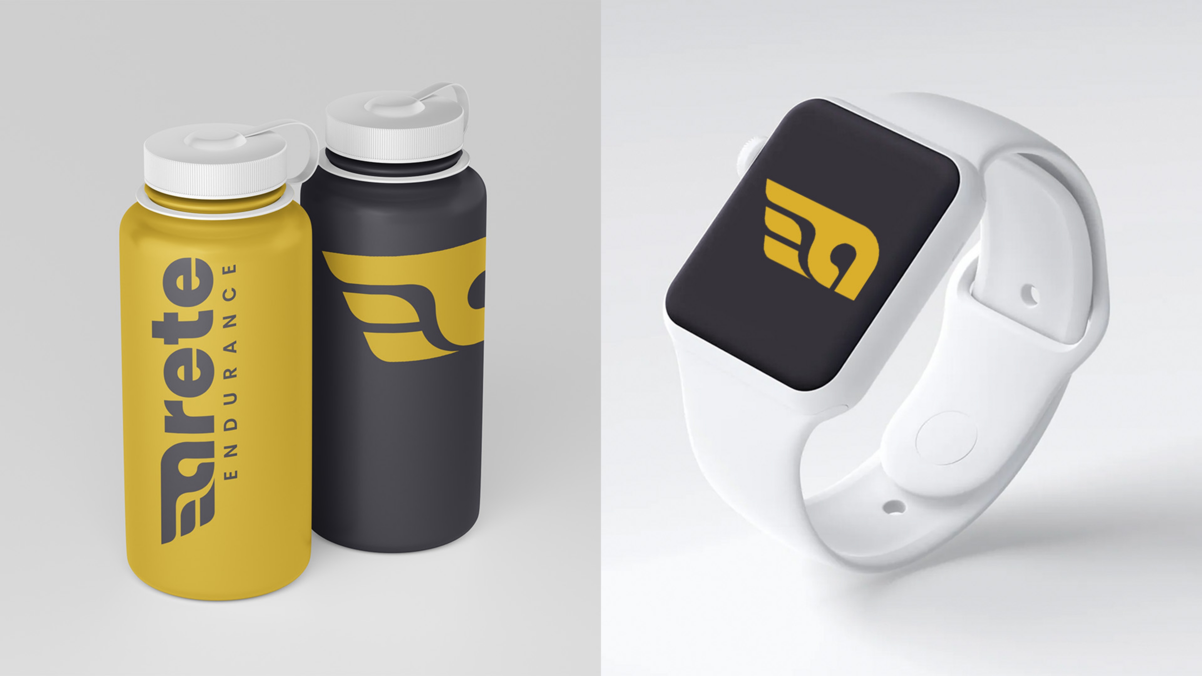
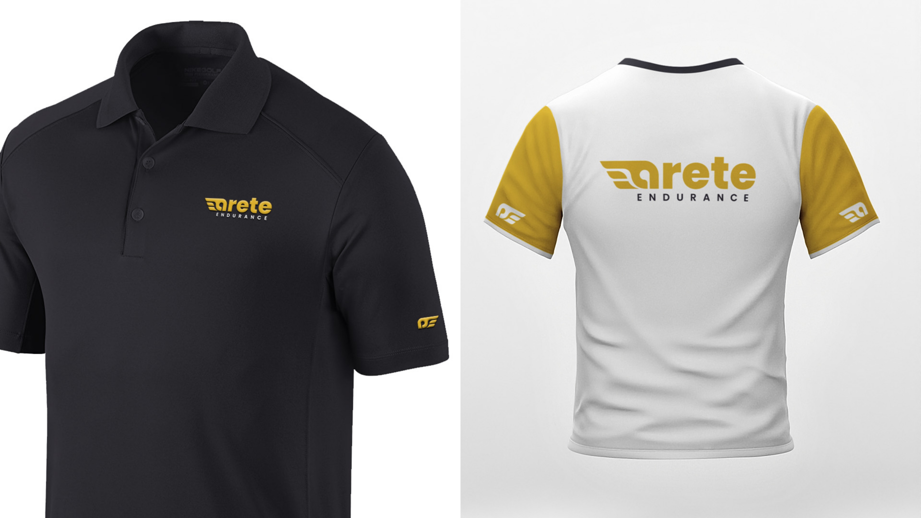
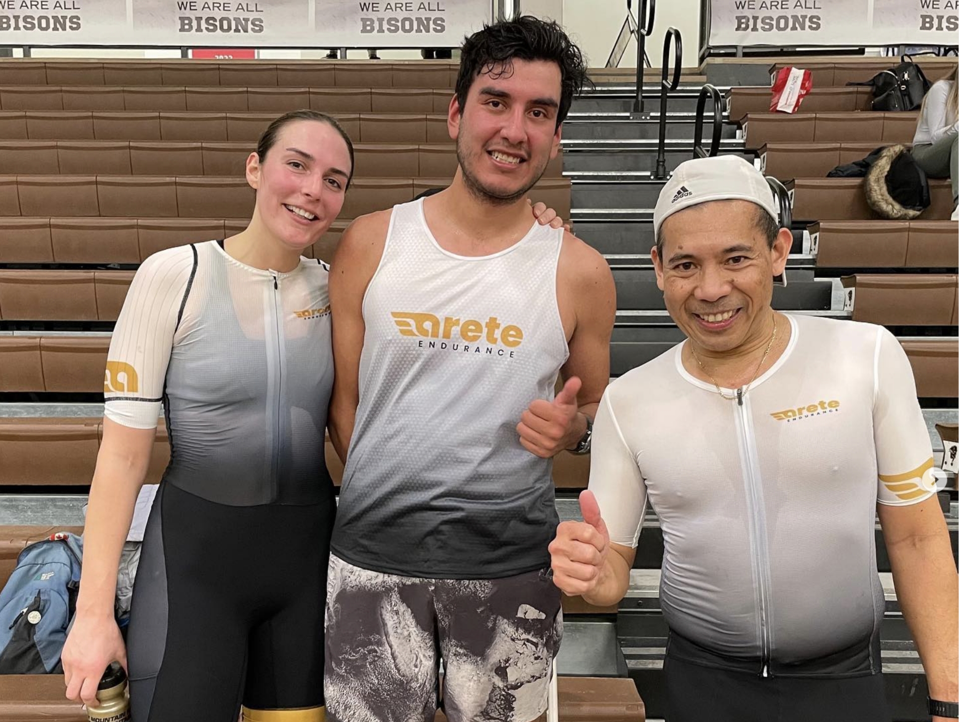
Notice how the icon can be used on the athlete’s jersey resembling the wings.
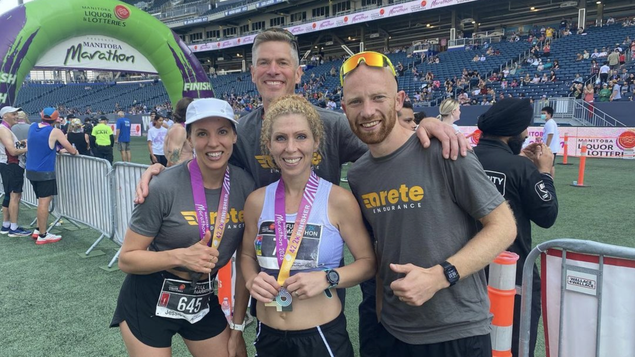
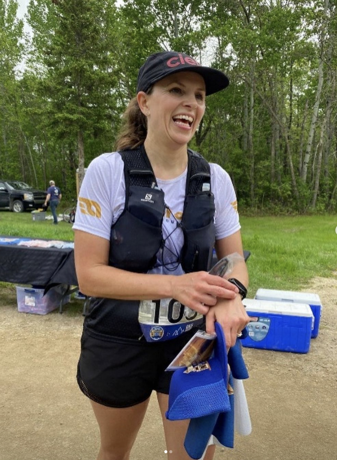
REAL-LIFE BRAND EXPRESSIONS
And this is how the brand came to life! I had no control over the execution, but I’m happy to see the logo working well on all applications.
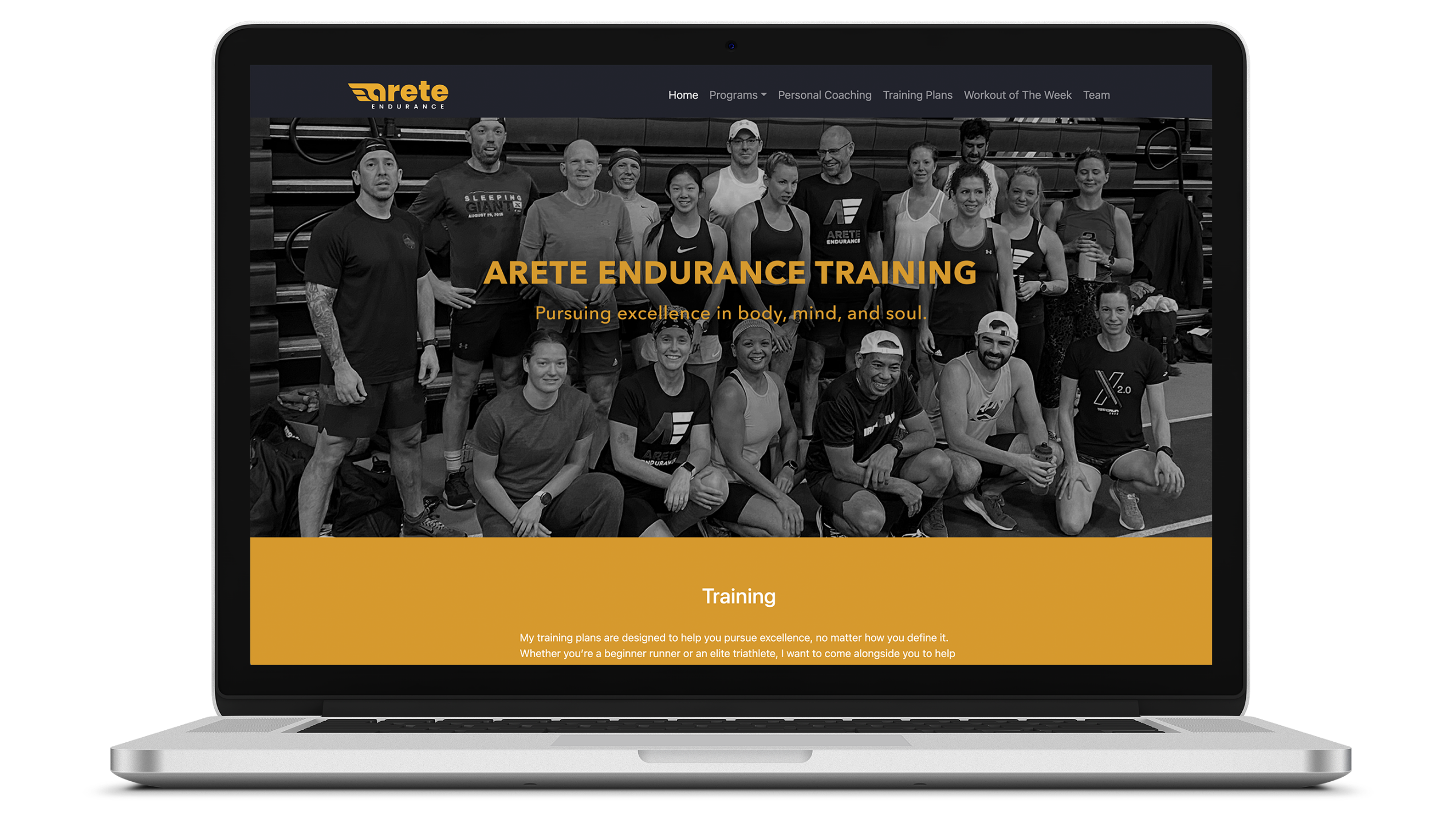
The website was created by the client.

Next Project
Meditek
Brand Architecture
![[object Object]](/assets/images/projects/Meditek/meditek_Hero.jpg)