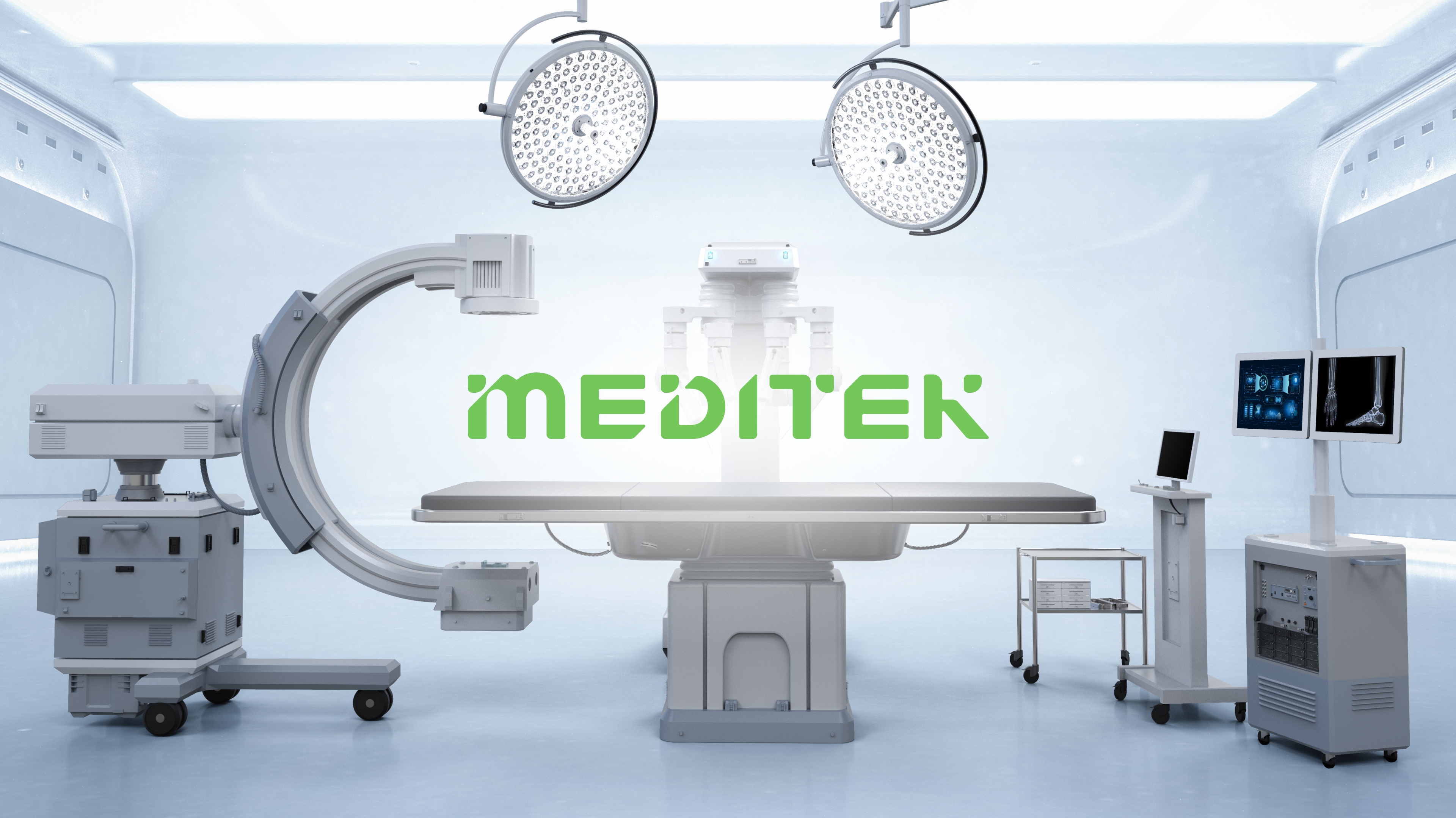
MEDITEK
Think Shift | Role: Graphic Designer*
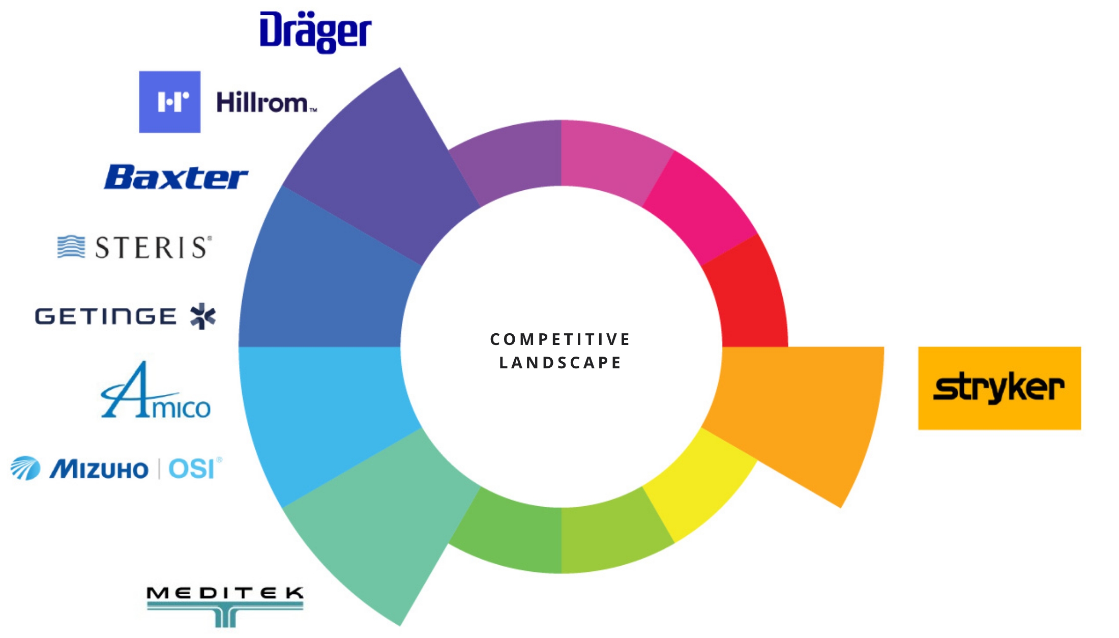
Brand Architecture
Think Shift | Role: Graphic Designer*
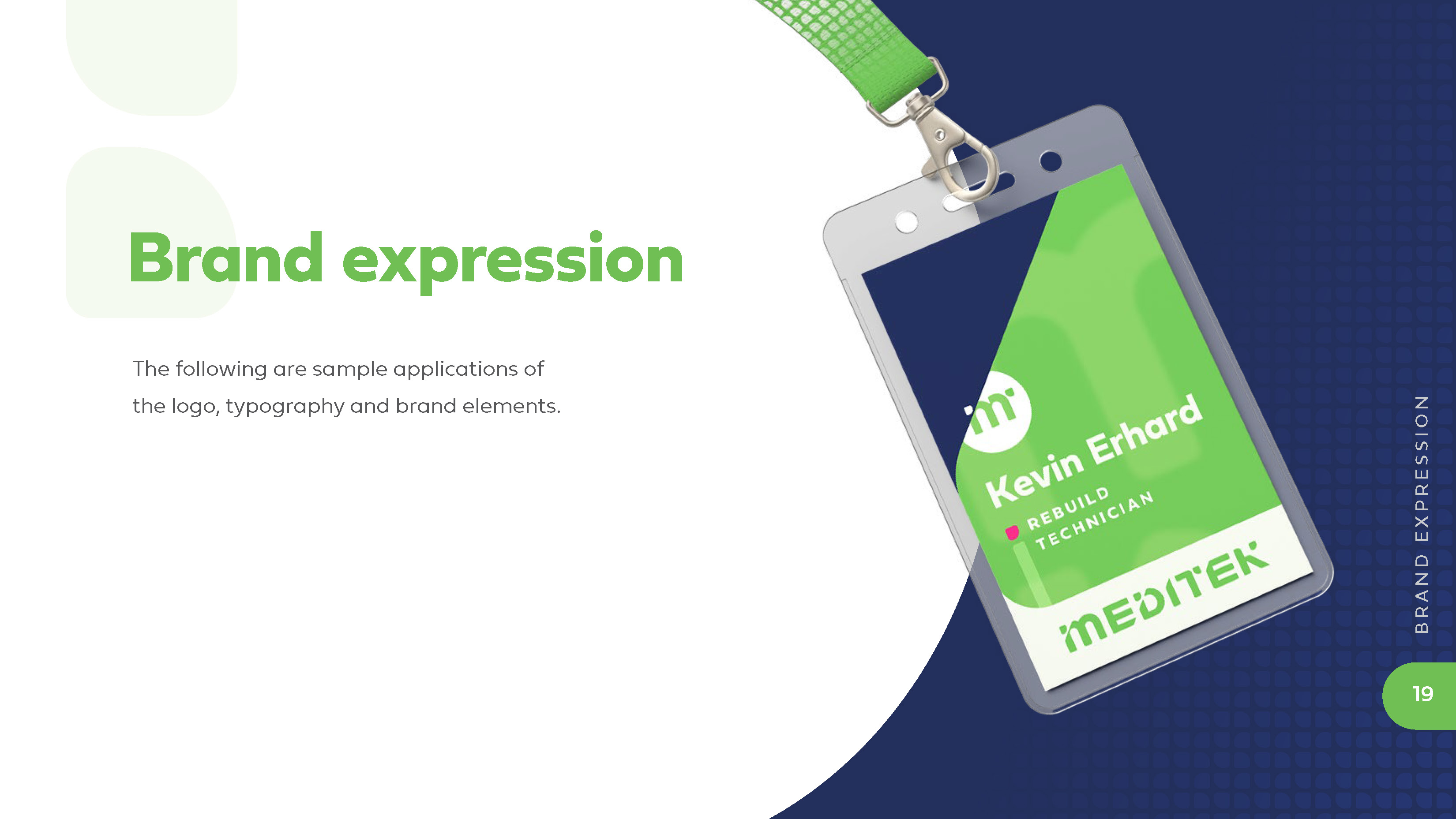
Overview
MEDITEK is an innovative Canadian surgical equipment distributor and trusted solutions provider that offers outstanding service, flexibility, creativity, passion, and an exclusive equipment selection. They are intensely focused on the needs of our customers and are committed to operational excellence.
OPPORTUNITY
The identity was outdated and no longer fit the brand’s ambition, so this was a great opportunity to lean into the flexible and customizable approach MEDITEK provides to their clients as well as differentiate the brand in the industry.
BRAND STORY
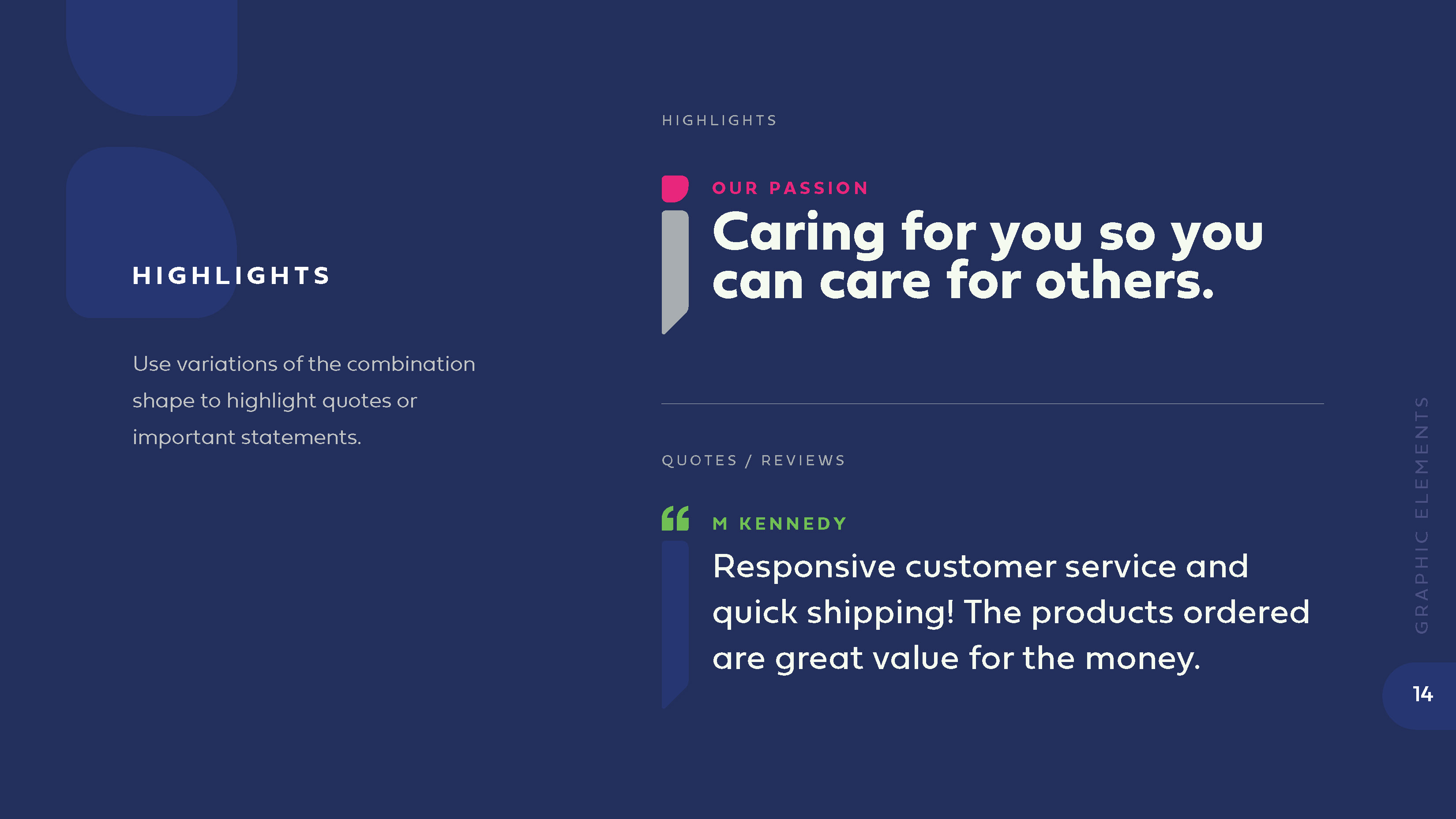
Our Passion: Caring for you so you can care for others.
Our Niche: Because no two healthcare challenges are the same, our solutions are different. We’re creative. We respond quickly. We make life easier.
INSPIRATION
Flexibility
Connectivity
Quick Response
Exploration
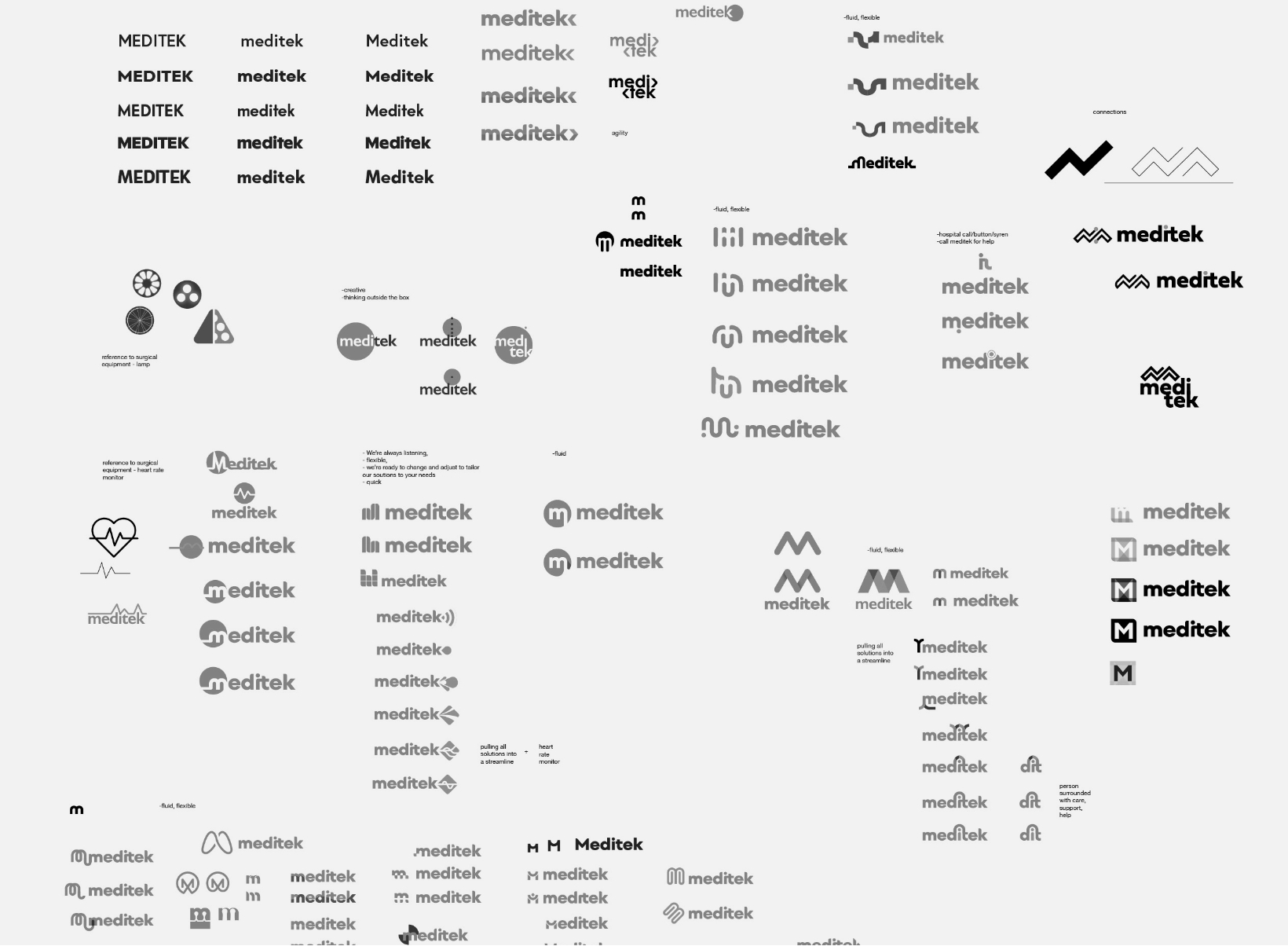

DESCRIPTION
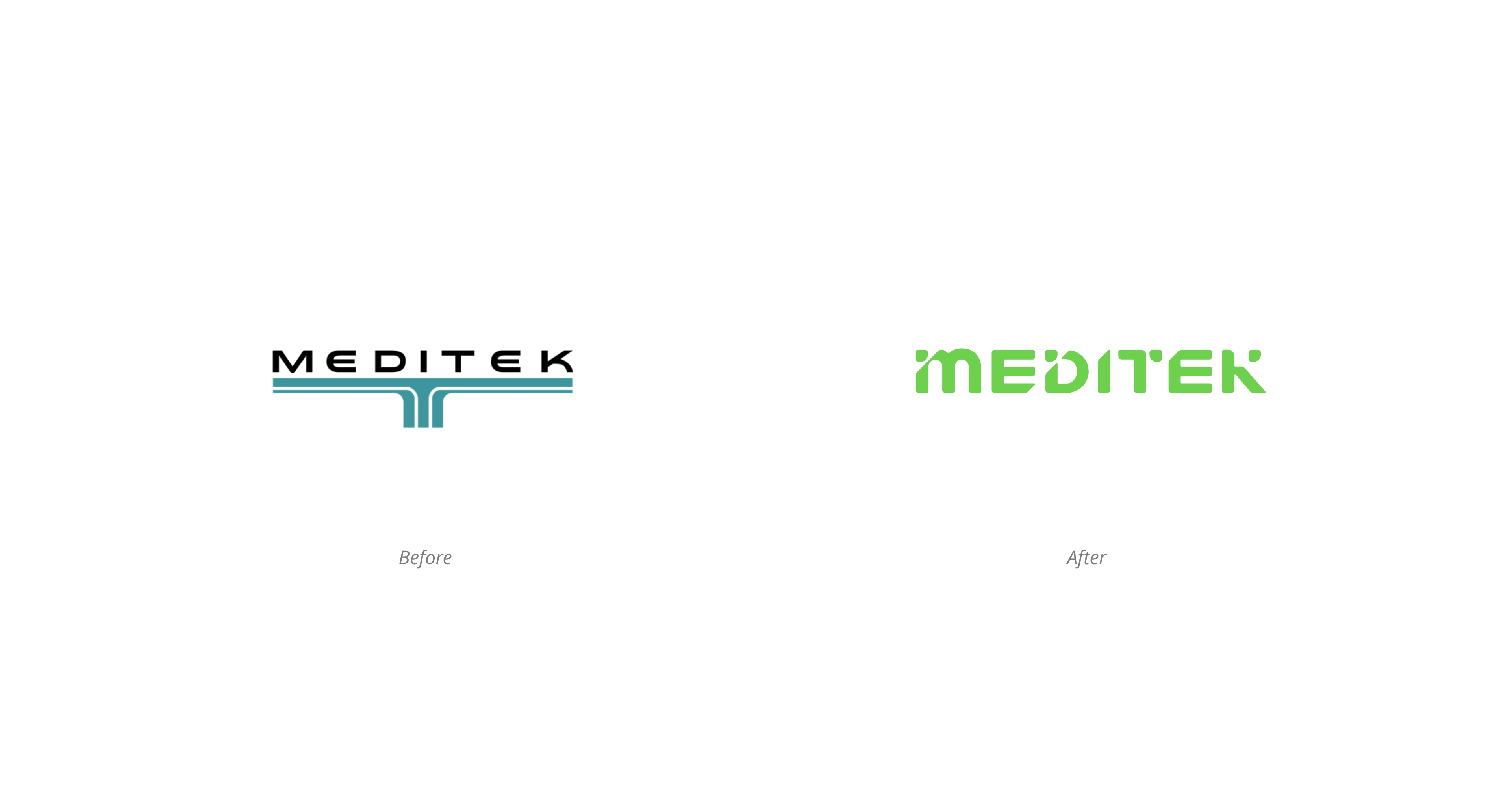
The logo represents MEDITEK as a professional and innovative company, but friendly and approachable with smooth corners and rounded shapes.
The logo is modular and can be rearranged to fit any space which speaks to the MEDITEK’s flexible and creative solutions as they have to adapt to a new space on a day-to-day basis. It gives an impression of the company that is willing to adjust and change approach based on your needs as a customer.
ELEMENTS
The logo becomes the brand expression rather than being a mark in the corner. Each letter is an element of the brand:
The lines in the letters flow creating a visual path from M to K speaking to the connection aspect. The dots symbolize MEDITEK creatively filling the gaps, being the final step to “make it all work.” The diagonal slashes refer to quick response adding a sense of movement and action.
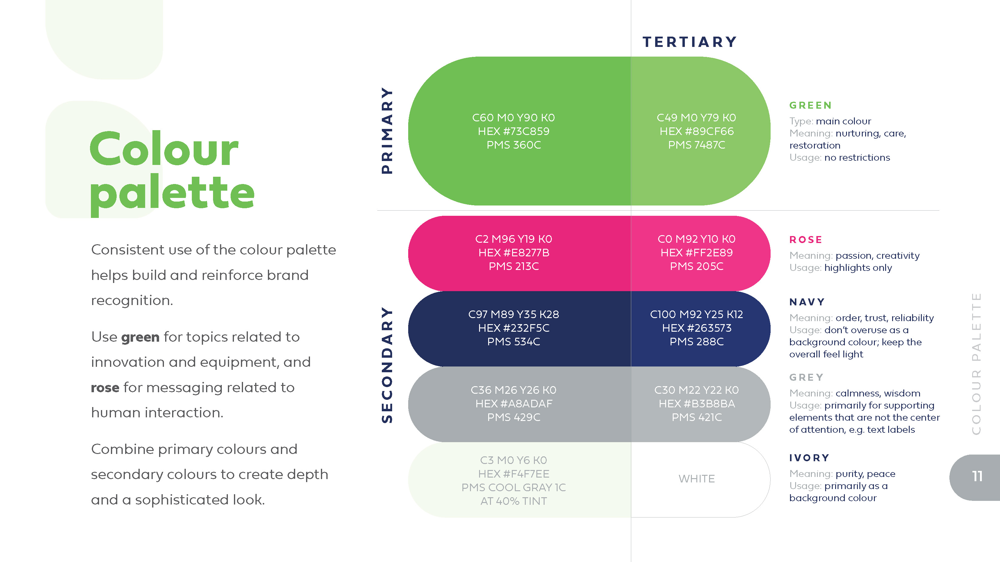
COLOUR
White becomes the primary logo colour and is meant to be primarily used on top of the green background.
There are a number of colours in the brand expression, particularly green and pink that are meant to differentiate services from products. The navy is a great background colour that helps elevate the bright colours.
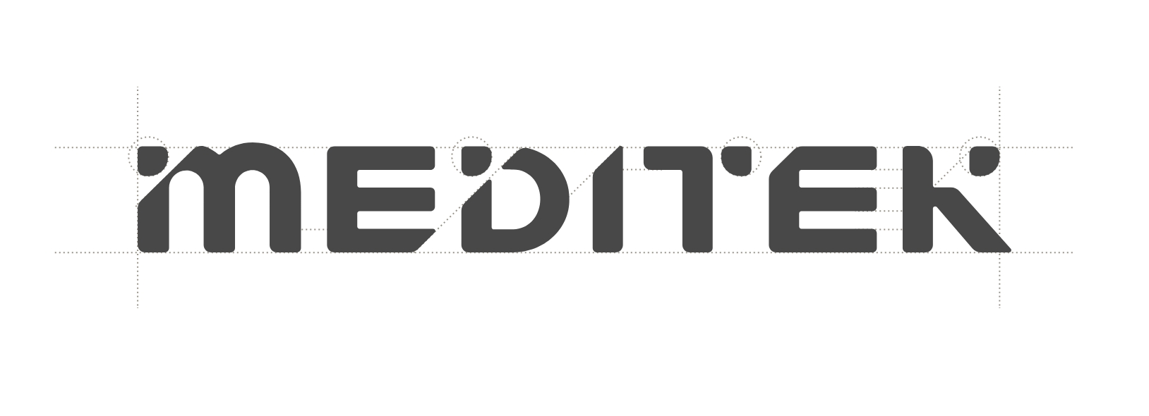
TYPOGRAPHY
The font of the logo is completely done from scratch. There is a mix of lowercase and upper case letters. Lowercase highlights the friendliness and the uppercase provides the structure.
The font of the brand expression is rounded and friendly. It fits well with the logo creating a continuous line, e.g., letter ”u” doesn’t have a stem.
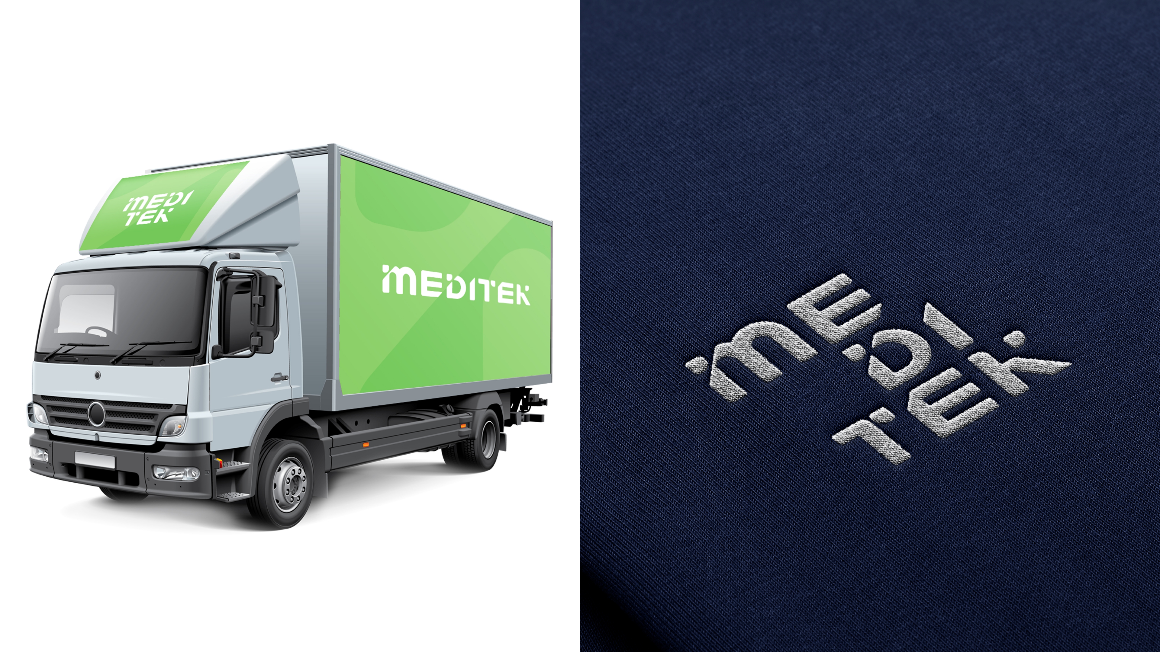
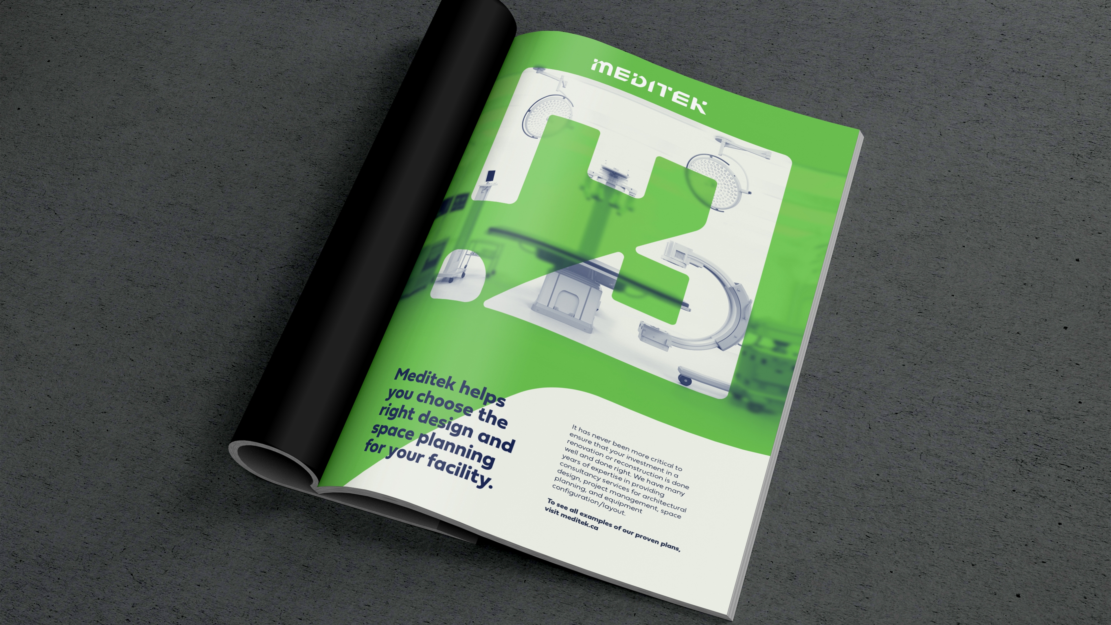
IDENTITY SYSTEM
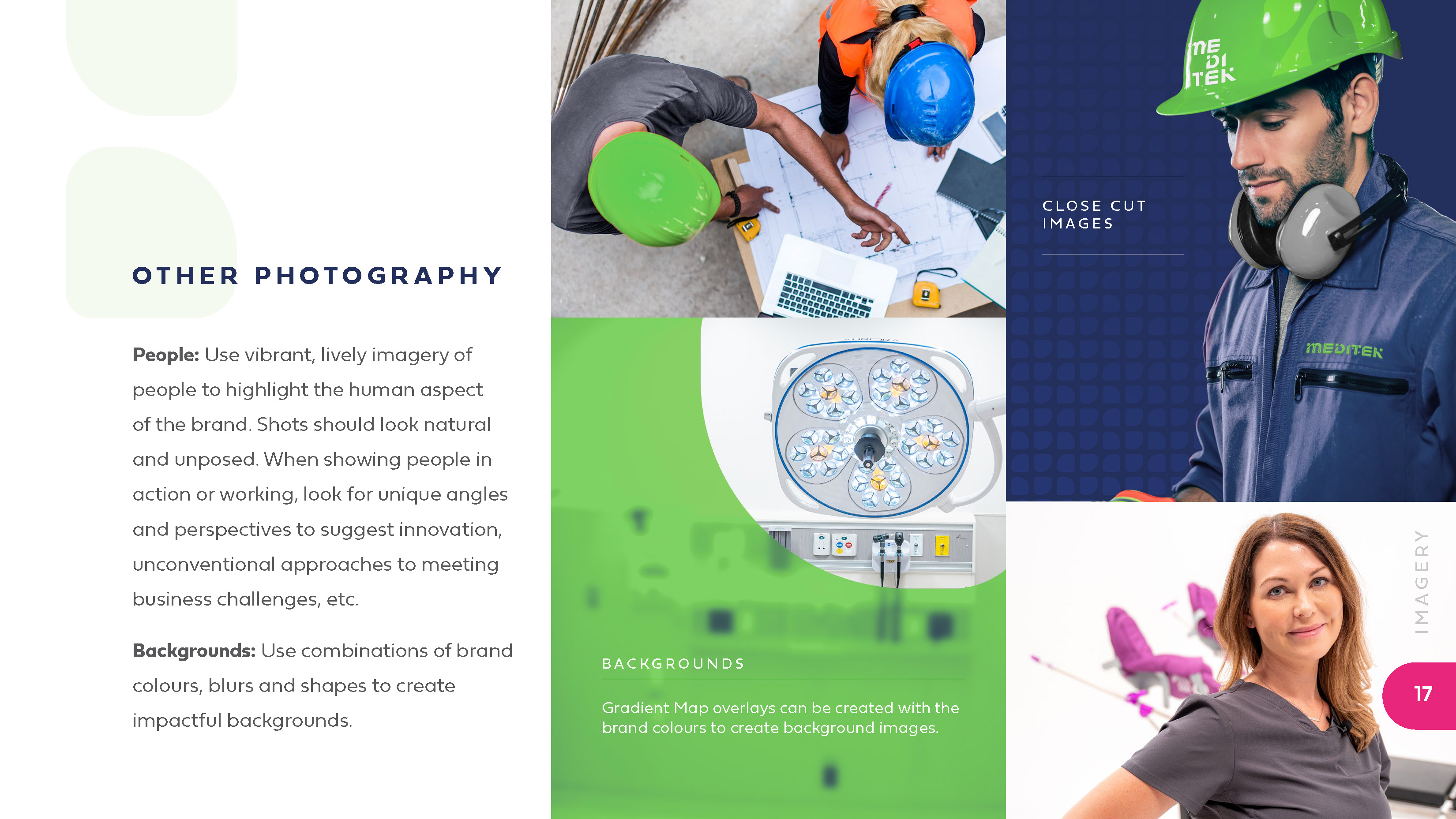
The brand identity is extremely flexible and customizable. Every element from the logo to the icons and the background elements use the same structure. The overall expression is light and modern, welcoming yet professional. It stands out from the competitor’s blue logo soup and doesn’t look corporate or unapproachable.
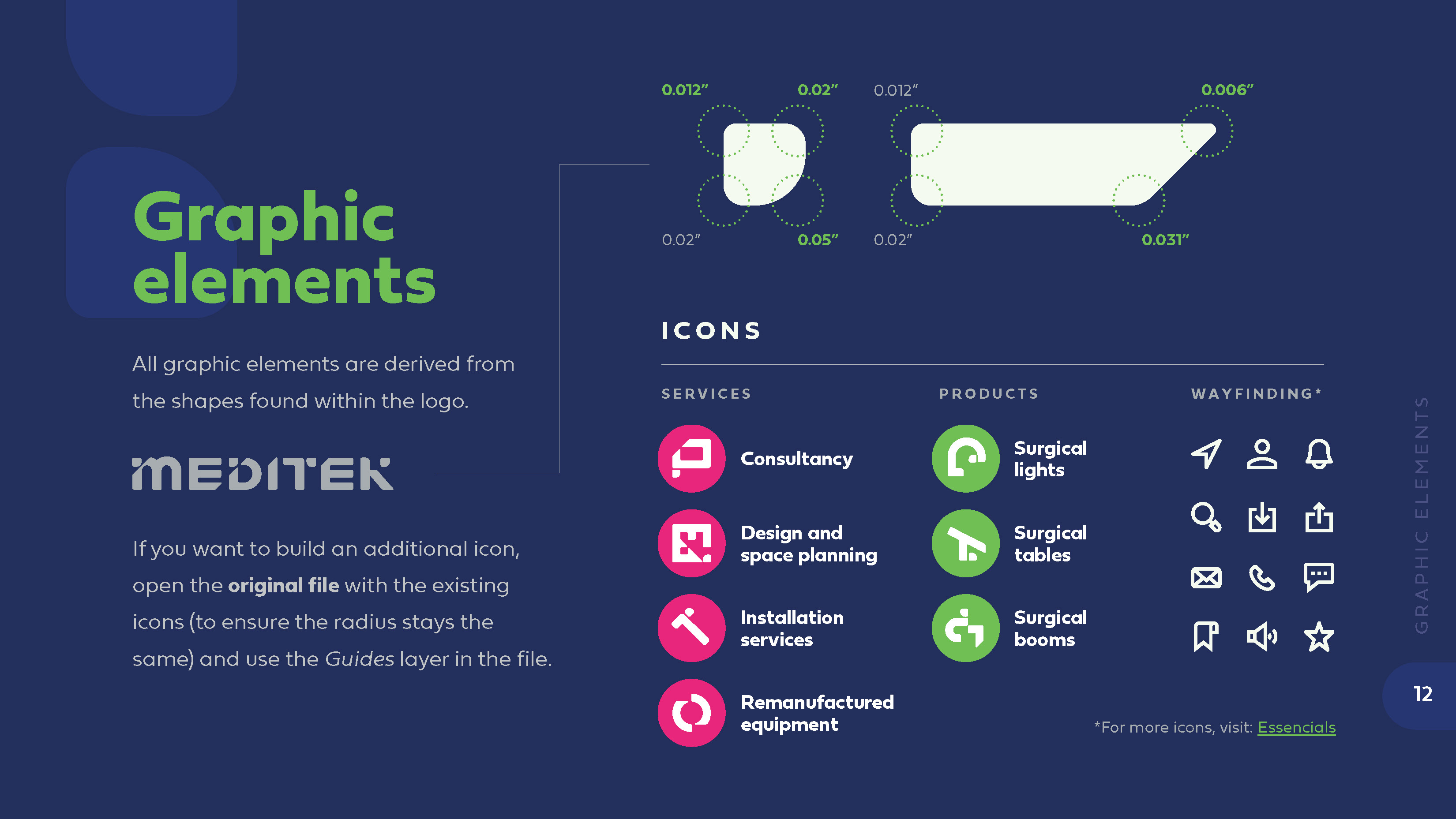
ICONS
All graphic elements are customized and are derived from the shapes found within the logo.

*CONTRIBUTION
I designed the logo and the rest of the ecosystem with the oversight from the Art Director.
Next Project
DAIRY, THE GOOD STUFF
Campaigns
![[object Object]](/assets/images/projects/dairy-the-good-stuff/DairyTGS_Hero.jpg)